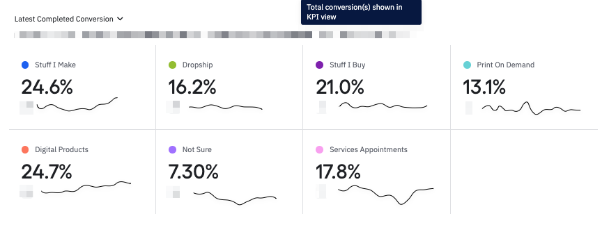
I drew examples here but it would be great to be able to see the trend line in addition to the latest or average conversion to allow the user to see both the snapshot and the over time information about the conversion rate

I drew examples here but it would be great to be able to see the trend line in addition to the latest or average conversion to allow the user to see both the snapshot and the over time information about the conversion rate

If you don't have an Amplitude account, you can create an Amplitude Starter account for free and enjoy direct access to the Community via SSO. Create an Amplitude account. You can also create a Guest account below!
If you don't have an Amplitude account, you can create an Amplitude Starter account for free and enjoy direct access to the Community via SSO. Create an Amplitude account. Want to sign up as a guest? Create a Community account.
Enter your E-mail address. We'll send you an e-mail with instructions to reset your password.