Question

Textbox with a single number calculated LIVE from the data source

  • 23 May 2024
  • 3 replies
  • 53 views

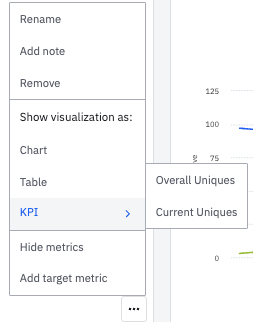
I have been creating singular text boxes in Looker Studio using BQ data. This data is updated live with the BQ data and has specific date ranges set on it, for eg: last week or last to last week date range.

I want to know how can I create such single data point text boxes with defined time ranges - which will give me a visibility on what my static metric is for any period of time.


I will use this to create a dashboard for my team where they can see how any metric has been performing for different periods. Graphs for this type of analysis with multiple data points become too cluttered.

3 replies

Userlevel 7
Badge +10

Hi @Shubham Patel 

The only way I see this possible in Amplitude is adding individual charts for those metrics in Dashboards and then choosing the KPI option in the visualization options

Afaik, there is no other way of showing a scorecard metric as custom visualization options are pretty limited in Amplitude.

Badge

@saish - actually I need the same data for multiple time frames beside each other. So, what I understand is that I will have to make individual graphs for each metric for every individual time frame - and then add KPIs to them?

Also, is there a way I can add multiple timeframes in the same graph.

Badge +2
Hi Shubham,

Thank you for writing in! My name is Audrey, and I am your Technical Support Agent here to help you.

You are correct that in Amplitude, you would need to create individual charts for each metric and for each specific timeframe you're interested in. Then, you can add these charts to a dashboard and set them to display as KPIs.

As for comparing multiple timeframes in the same graph, currently, Amplitude's 'Compare to past' option (at the top of the chart) only allows you to compare a metric with one other timeframe. For instance, you can compare today's data with yesterday's, but not with the day before yesterday at the same time.

However, one thing that may be useful for you is Adam Greco’s **Amplitude Google Sheets Add-On**. This will allow you to import charts or cohorts (for instance populations that bought you product today, yesterday, a month ago...) directly to a Google Sheets doc. That way, you can manually create a table that extract the data you’re interested in from your charts and cohorts. You would only have to “update” those implemented data directly in Google Sheets by simply clicking on an update button from the add-on.

I hope this helps! Let me know if you have any other questions.

Best,
Audrey


P.S. Checkout upcoming events and user meetups on our events page.

Reply