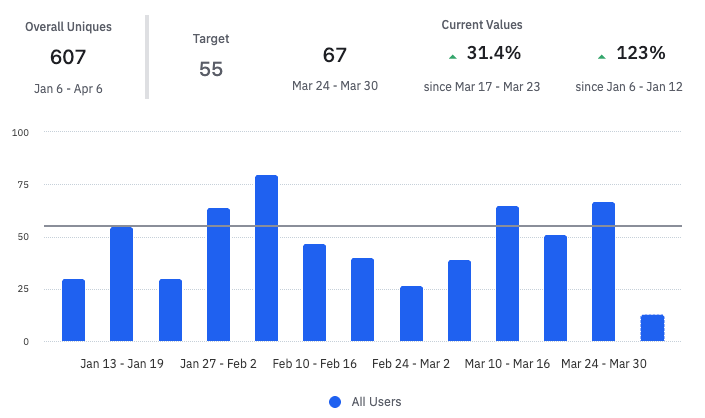
There are many cases where I’ve created a line chart where I want to be able to visualize when we have reached a certain milestone, or where I want to be able to see the average line across a time frame, or maybe both.
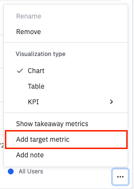
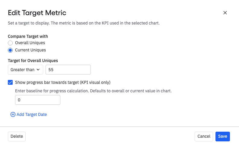
These lines would be completely flat across the entire time period. They would just require the ability to add a label and select a color. They could be static (like a Goal or Benchmark) or dynamic (like a Median or Average).
I think this would also be a good option to add as a checkbox in the Alerts feature, so that we can see where the alert levels are.
I’d like for these to appear in the Dashboard and Report views as well.


