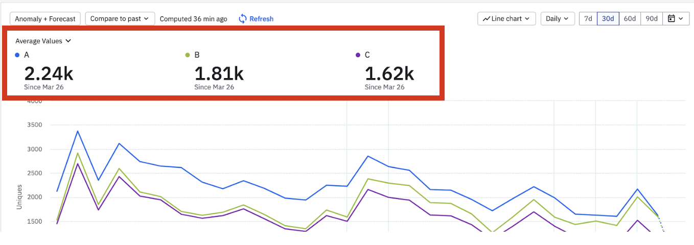
Lets say I have 3 segments showing the uniques of a given event, and I want to show on a dashboard the daily average uniques of each segment during the given time period (in this case 30d).
In the line chart I can chose Average Values to get those metrics:
However if I show this chart in the dashboard I can not get the average metrics.
In the KPI options its not available:
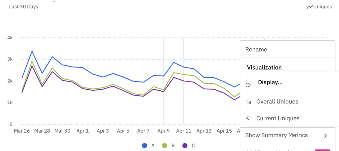
IF I change to the table view I can get the current day, and the previous day but not the Average.
I could try change the chart to a Bar chart in order to force only have one value for the period, BUT that would no longer be the average during the period but rather the deduped uniques during the total period.
I can not think of a formulario or rolling avg o window to get Daily average uniques for the given time period as a single metric to then show on a dashboard.
For now the option is to have the Average value as the metric on the Line Chart, have the line chart on the dashboard, and the user then needs to enter into the chart to see the average.