Solved

Is there a way to display cumulative totals or overall averages in dashboard view?

  • December 15, 2021
  • 3 replies
  • 1546 views

Forum|alt.badge.img

Hi everyone,

Thanks in advance for your help. I am having some trouble with the way my charts are displayed within a dashboard. 

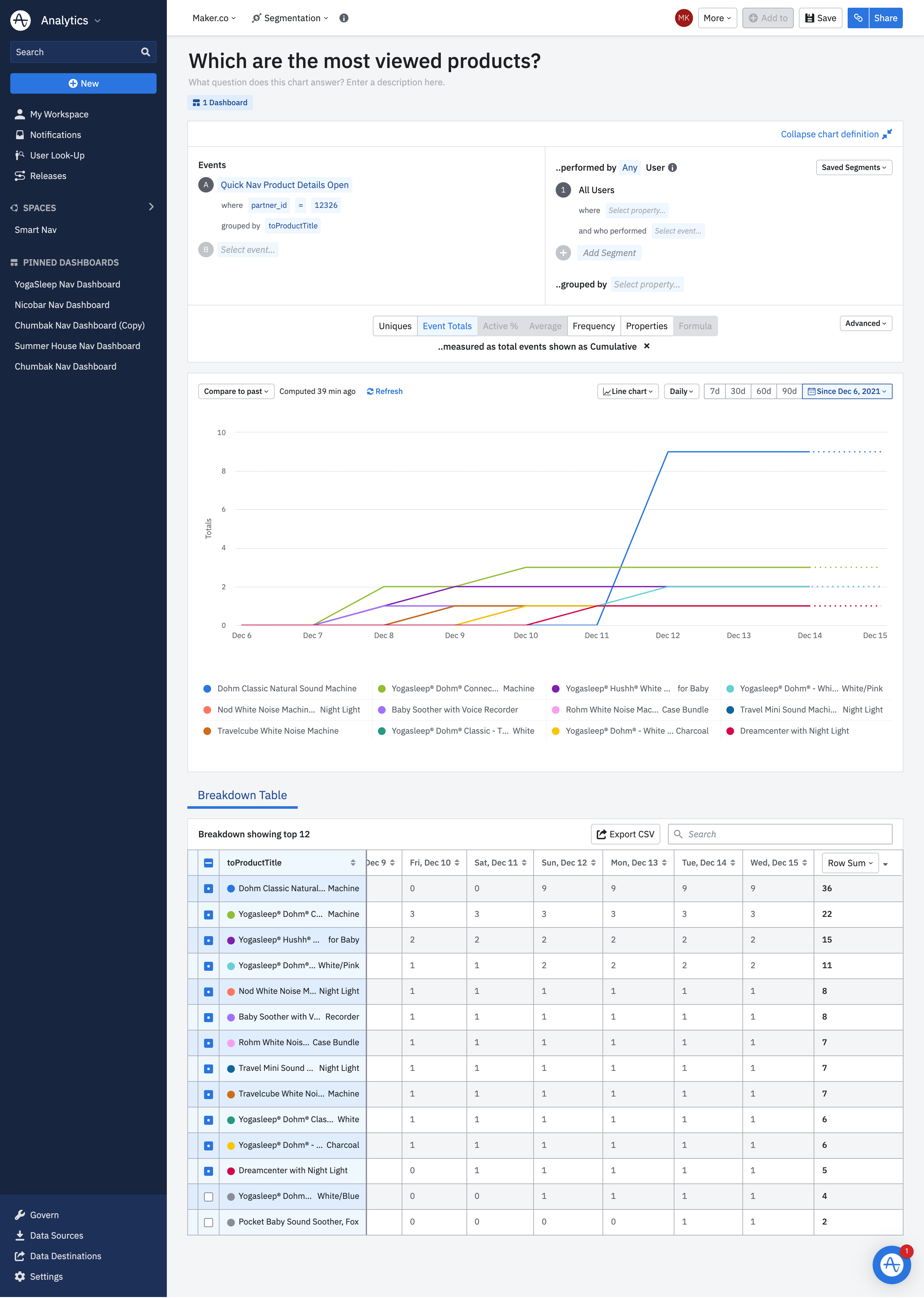
For example, in the screenshot below, I have created a segmentation chart to see Which are the most viewed products for a particular brand. I measured the data as cumulative total events ordered the rows by Row Sum as can be seen in the right most column of the table below.

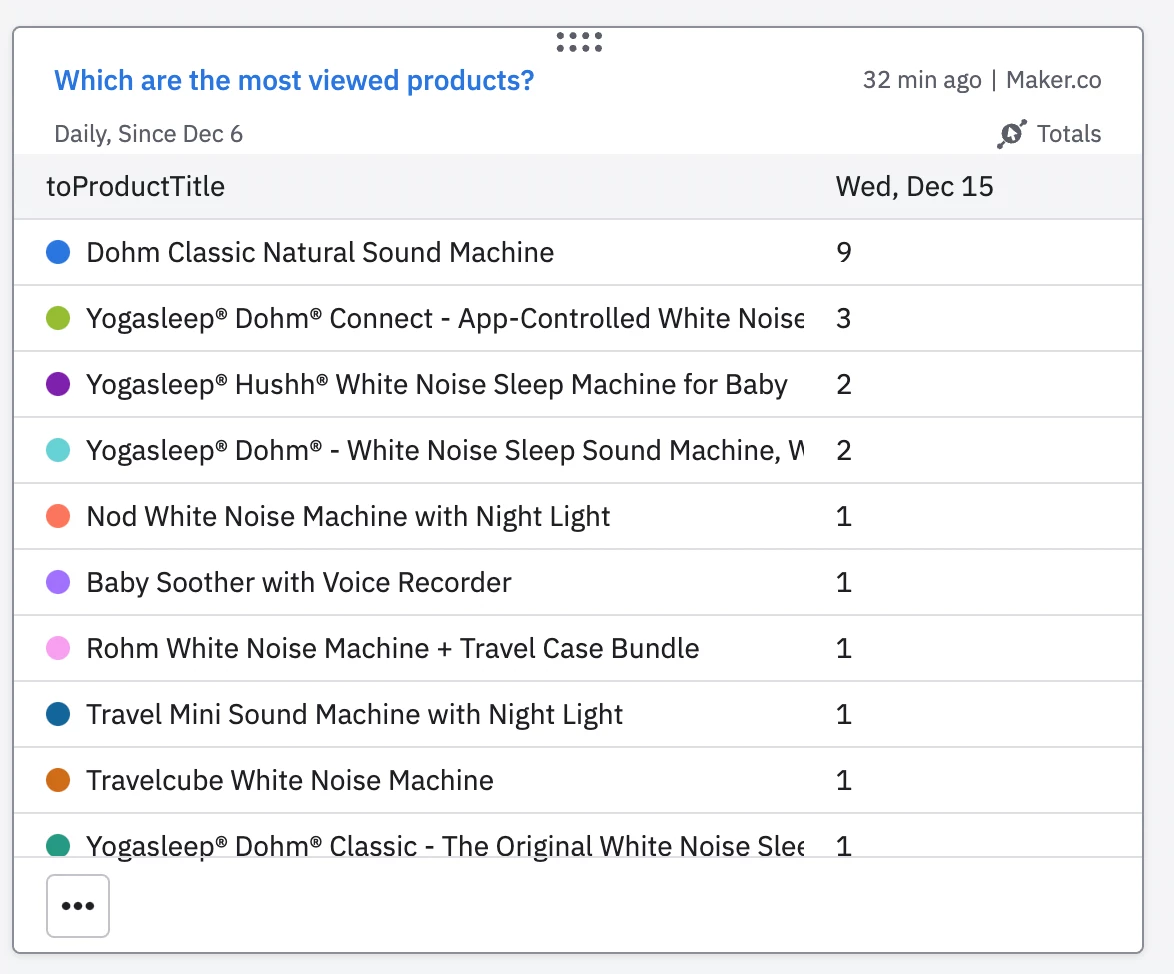
However, when I add this chart to a dashboard (screenshot below) it only shows the previous days total events and does not display the cumulative totals. This forces any viewer to have to click into each chart individually and scroll all the way down to the table to see the totals, defeating the entire purpose of a dashboard. 
Is there any way to change this display?


Thank you,

Maitreya

Best answer by Saish Redkar

Hey @maitreyakundalia 

From what I’m understanding of your use case, the cumulative event total you are seeing and the row sum of the table breakdown are to be interpreted differently.

Till Dec 15th, the cumulative sum of your event count under the “Dohm Classic Natural Sound Machine” group was 9, which is correctly reflected as shown in the event seg chart as well as in the dashboard view of the chart.

The number 36 is actually just the arithmetic sum of the individual days cumulative count in the breakdown table for the “Dohm Classic Natural Sound Machine” group ( which is what you might be currently expecting in the dashboard view of the chart ).

Let me know if I have interpreted your question correctly.

View original
Did this topic help you find an answer to your question?

3 replies

Saish Redkar
Expert
Forum|alt.badge.img+10
  • Expert
  • 1377 replies
  • Answer
  • December 15, 2021

Hey @maitreyakundalia 

From what I’m understanding of your use case, the cumulative event total you are seeing and the row sum of the table breakdown are to be interpreted differently.

Till Dec 15th, the cumulative sum of your event count under the “Dohm Classic Natural Sound Machine” group was 9, which is correctly reflected as shown in the event seg chart as well as in the dashboard view of the chart.

The number 36 is actually just the arithmetic sum of the individual days cumulative count in the breakdown table for the “Dohm Classic Natural Sound Machine” group ( which is what you might be currently expecting in the dashboard view of the chart ).

Let me know if I have interpreted your question correctly.


Forum|alt.badge.img

@Saish Redkar Thank you so much! I can’t believe I did not realize this. Your interpretation is absolutely correct and makes perfect sense.

Thanks for answering both my questions!


Denis Holmes
Team Member
Forum|alt.badge.img+8
  • Team Member
  • 448 replies
  • December 16, 2021

Hi @maitreyakundalia ,


Thanks for writing into Amplitude Community. Happy to help!


Unfortunately, this would be the default behaviour and there would not be a way to change what the chart is displaying in the dashboard. Having said that, you are not the first person to mention this. Would it be ok with you if I were to add this to the product feedback team as an extra case? If so, would you be so kind as to PM me the email you use for Amplitude and I can add it. 


Thank you!


Kind Regards,
Denis


Reply


Cookie policy

We use cookies to enhance and personalize your experience. If you accept you agree to our full cookie policy. Learn more about our cookies.

 
Cookie settings