Solved

Number of days a user / segment performed an event in a certain time range

  • February 4, 2022
  • 3 replies
  • 931 views

Forum|alt.badge.img

Hey everyone! 


I’m trying to create a report that shows me the users who logged in the most to my platform on different days in the last 3 months. By that, I mean that if the same user logged in multiple times on the same day I only want it to count once. 


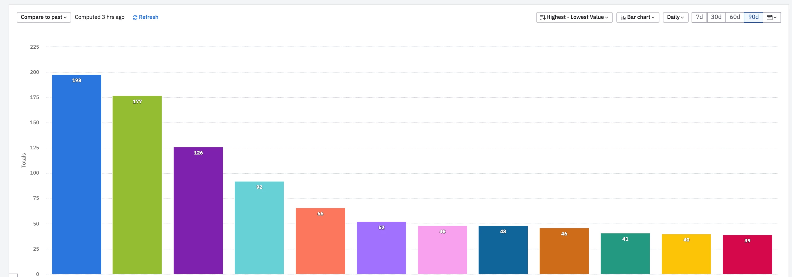
My expected final result is something similar to the screenshot below, but instead of having all Event Totals, have the number of different days when they performed the action.


Right now, the only way I can find to do it is to:

  1. create a Segmentation chart with the Login event
  2. group it by User ID
  3. filter it by the last 90 days, display it Daily and by Unique
  4. download the data, and sum for each user the number of days with values

The last step doesn’t allow me to share this with other people in the company or have easy access to the data. If anyone knows a way to do it, I’d really appreciate it! 


Thanks!

Best answer by eddie.gaona

Hello @DiogoGuerra I would definitely echo what @Saish Redkar has proposed above.

The Stickiness chart will showcase the number of unique days a user has performed an particular event. For example, looking at this chart from the Demo: https://analytics.amplitude.com/demo/chart/new/zdxb3x2, the 9 days data point means that 1.78% of users performed the event, Main Landing Screen, on 9 unique days during one month.

The percentages you see on the chart is a weighted average of the Last 3 Months and that data can be found in the breakdown table below the chart.

More information on how to interpret the Stickiness chart can be found, here.

View original
Did this topic help you find an answer to your question?

3 replies

Saish Redkar
Expert
Forum|alt.badge.img+10

Hey @DiogoGuerra 

If I’m understanding your use case correctly, then a stickiness chart might be a good option to explore. Similar to this demo chart.

Once you have the desired view and time period , you can download the users from the specific datapoint via Microscope if you need to.

Let me know if this helps.


eddie.gaona
Team Member
Forum|alt.badge.img+9
  • Amplitude Support
  • 161 replies
  • Answer
  • February 5, 2022

Hello @DiogoGuerra I would definitely echo what @Saish Redkar has proposed above.

The Stickiness chart will showcase the number of unique days a user has performed an particular event. For example, looking at this chart from the Demo: https://analytics.amplitude.com/demo/chart/new/zdxb3x2, the 9 days data point means that 1.78% of users performed the event, Main Landing Screen, on 9 unique days during one month.

The percentages you see on the chart is a weighted average of the Last 3 Months and that data can be found in the breakdown table below the chart.

More information on how to interpret the Stickiness chart can be found, here.


Forum|alt.badge.img
  • Author
  • New Member
  • 1 reply
  • February 9, 2022

Thanks @Saish Redkar and @eddie.gaona for your replies! 

I took a look at the chart examples you sent through, but I believe there’s something fundamentally wrong with the way the Stickiness chart aggregates data. It seems that, when choosing a Last 3 Months time range, the chart doesn’t show more than 30 days’ worth of data. So if a user has performed one event in more that 30 unique days, its data will come back separated into 2 data points. 

Starting from this example that @eddie.gaona sent through, I’ve added a group option (by User ID), just to understand how the Stickiness chart is processing the same user’s data. As you can see in the screenshot below (and the demo chart here as well), for the same user ID 5411046370388616193 the chart says they performed the event in 21, 23 and 24 different days:


This means that, because I want to know the total number of times they’ve performed the event, I’d have to add for each user all the data points that I get from the chart, taking me back to my initial problem of having to export the data. 


Let me know if I’m misreading the Stickiness chart data in any way or if this isn’t the most appropriate chart for what I’m looking for. 

Thanks again!


Reply


Cookie policy

We use cookies to enhance and personalize your experience. If you accept you agree to our full cookie policy. Learn more about our cookies.

 
Cookie settings