News

Custom Y-Axis

Related products: Product Analytics


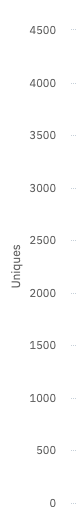
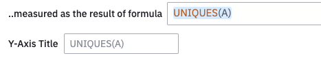
Users can now customize the Y-Axis of a chart by setting a min and max value, then saving with the chart definition! Previously the Y-Axis was dynamically set, and customers could only temporarily zoom in or out. This feature also helps to have a consistent Y-Axis across charts when adding them to dashboards.


Let us know what you think!

It’s not something I use particularly often, but occasionally I find this really helps - there are some charts, particularly if using a custom formula, when a certain minimum value just makes logical sense. Equally some charts are easier to interpret if seen on the right axis scale. Good job!


Hey @Product Team 

Is there anything on the roadmap to also enable customizing Y axis Title in other metric views?


Currently, it’s only possible only in the Formula view.


Hi @Saish Redkar 😃 Thanks for this question. I can submit it to the product team for feedback.