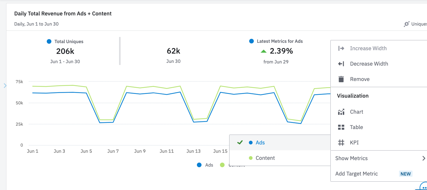
You can now view metrics for charts with multiple series on dashboards, and toggle which series to visualize. We’ve also added descriptive labels along with matching series colors to make it easier to understand the metrics you’re viewing. This is available for event segmentation, sessions and revenue charts on saved dashboards. This can be set up by clicking the options icon on a chart saved to a dashboard, and clicking “Show Metrics.”

Series selection for metrics in dashboards

 +2
+2Be the first to reply!
Reply


Welcome to the Amplitude Community!
If you don't have an Amplitude account, you can create an Amplitude Starter account for free and enjoy direct access to the Community via SSO. Create an Amplitude account. You can also create a Guest account below!
If you're a current customer, select the domain you use to sign in with Amplitude.
analytics.amplitude.com analytics.eu.amplitude.comor
Welcome to the Amplitude Community!
If you don't have an Amplitude account, you can create an Amplitude Starter account for free and enjoy direct access to the Community via SSO. Create an Amplitude account. Want to sign up as a guest? Create a Community account.
If you're a current customer, select the domain you use to sign in with Amplitude.
analytics.amplitude.com analytics.eu.amplitude.comor
Enter your E-mail address. We'll send you an e-mail with instructions to reset your password.