Solved

How to show total count of users, against the count of users that "continue" in an experience

  • 5 January 2023
  • 5 replies
  • 367 views

Badge

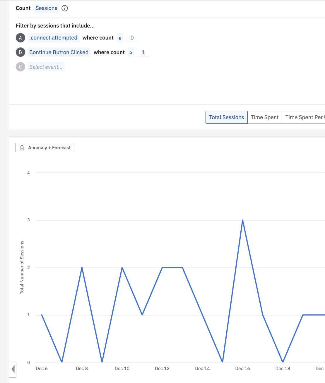
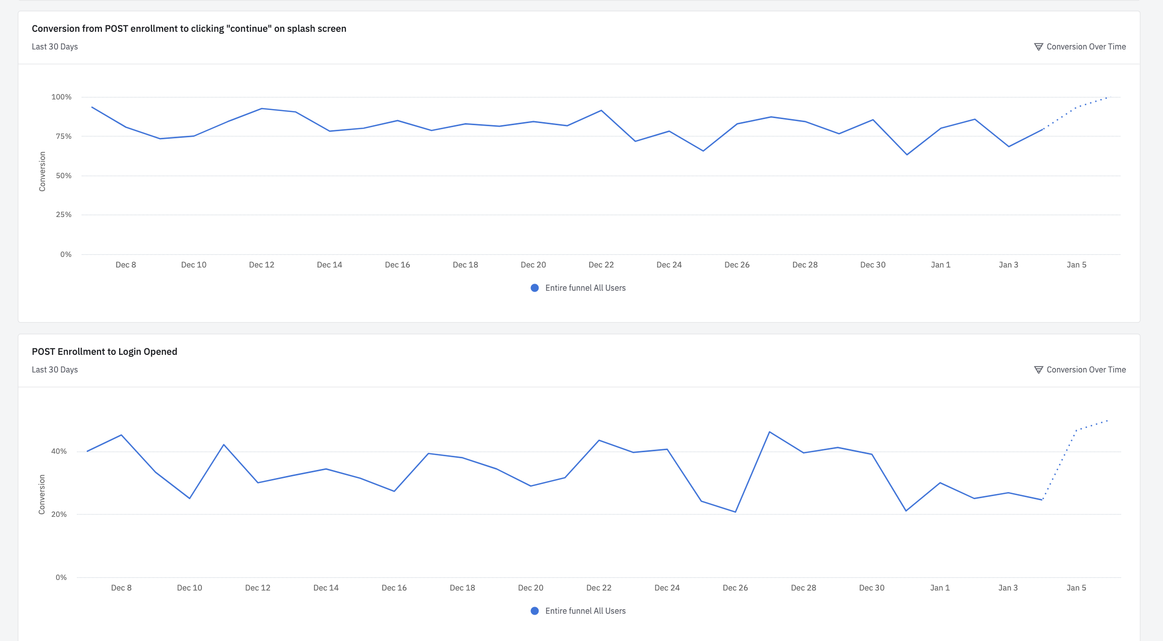
Our product has two events, one to represent the start of an online experience - “connect” - and one to represent the first step in continuing down that experience “continue”. 

I am trying to visualize the daily number of users that connect, let’s say 100 today, and the percentage of those that continue, let’s say it ranges from 20-40 depending on some factors. 


How do I do that with our current view? It continues to appear as a single line. 


icon

Best answer by belinda.chiu 6 January 2023, 18:54

View original

5 replies

Userlevel 7
Badge +10

Hey @adam12 

The Funnel Analysis chart is a better choice for this use case. You can read more on that here.
Something similar to this demo chart with your events plugged in.

Hope this helps.

Badge

Hey there. I’m not understanding how to overlay the comparison. In this instance, I want these lines to be shown over one another on the same glass which does not seem possible: 


I am tracking the conversion of users that go from event A to B, and then those who make it from event A to B to C. 

Badge

@Saish Redkar 

Userlevel 6
Badge +8

Hi @adam12 ! Saish’s recommendation of using Funnel charts is perfect for what you are looking for if you want to look at users converting through a flow of events. It is the case though that the Funnel charts only allow for one conversion flow at a time. So to “overlay” a comparison, most customers are doing what you did and put the two Funnel charts side-by-side on a dashboard. 

I can see how this could be helpful to overlay two different Funnel flows on top of each other. Please head over to the Ideas page in Community to share your feedback with our Product team!

Userlevel 7
Badge +10

Thanks @belinda.chiu


@adam12 As Belinda said, the current workaround would be to have the comparison done on two different funnel charts on a dashboard.

Reply