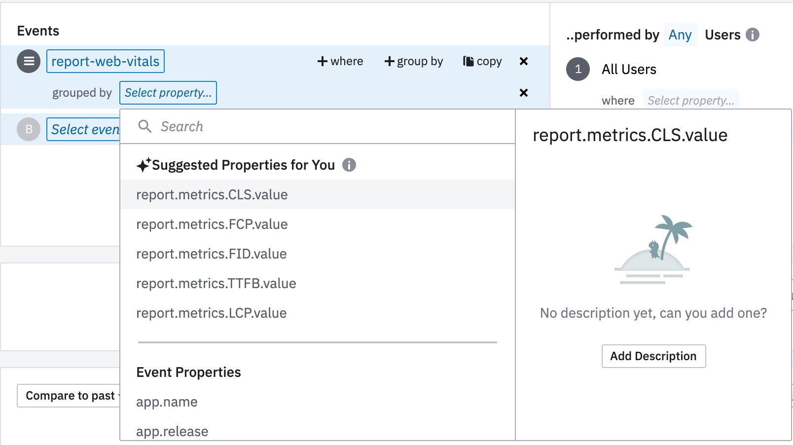
 

I’m trying to build a Chart to see the values for CLS, FCP, FID, TTFP and LCP. The events contain all those values within it (as event properties).


My goal is to generate a graph with 5 lines, one for each “value”. I wasn’t able to achieve that so far. Do I have to send each value in a separate event to be able to exploit those data like that? That would rather be inefficient. I hope I’m missing something.


I’m on the free plan.

Hey @Ambroise 
A group by clause on a property would spilt it into the different values that property has recorded on the desired period of time. So a group by on your “report-web-vitals” event on any property will generate numerous graphs for the various values recorded under the property based on distinct values of that property.

I’m assuming CLS, FCP, FID, TTFP and LCP are all numeric values?

What I think might help in this case is applying some aggregation on each of the 5 properties using the Properties feature so that you can have one aggregated value for each of the event properties and graph them in a 5 line segment chart over time.

A typical aggregation for your case would be using the Median of Property Value or Average of Property Value under the Properties feature.

You will have to copy the “report-web-vitals” event 5 times in the Event Section and use group by on each of those individual properties respectively and then apply the Properties feature. 

So essentially answering the question - What’s the median/average value of the CLS, FCP, FID, TTFP and LCP properties over X time period?


Let me know if I have interpreted your use case correctly.


Thank you, and yes those are all numbers.


Here’s what I achieved, using your method.


I wanted to use each value in a line but I don’t see how that’s possible. Using the median is the next best thing, thank you!


Hey @Ambroise 
When you say “ use each value in a line “, are you referring to visualizing the aggregate median value of each of those properties in a line chart instead of a stacked area chart?


Hey @Ambroise 
When you say “ use each value in a line “, are you referring to visualizing the aggregate median value of each of those properties in a line chart instead of a stacked area chart?

I’m referring to visualizing the value (not an aggregate) of each of those properties in a line chart (or stacked area, depending on which one reads better, but that difference is trivial).


Hi @Ambroise, I hope all is well. Somehow we missed your follow-up note. I’m looping in platform specialist @ning.chang, who can take a closer look if needed. Thanks for being a part of the community! :relaxed:


Reply