Solved

Why is retention chart showing data that shouldn't exist yet?

  • 27 August 2021
  • 1 reply
  • 119 views


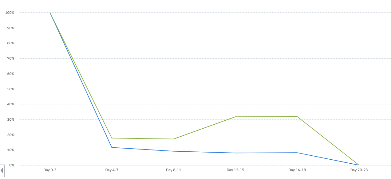
The green line looks at a cohort of users post-feature change. The blue line targets a cohort of users pre-feature change. It hasn’t been 16 days yet, but the retention chart is populating with data that shouldn’t exist yet. Why?

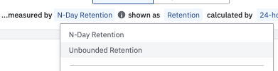
And how can I make this a cumulative view -- e.g., see retention by day 7, 14, 30 instead of day 0-7, day 7-14, day 14-30?

icon

Best answer by Saish Redkar 27 August 2021, 03:01

View original

1 reply

Userlevel 7
Badge +10

Hey @sydney 

One of the common reasons for this is that the selected timeframe could have incomplete data points, owing to the uneven user counts within each day.

Here are some posts which explain this in detail and retention calculation in general - 


Also, it looks like you are using custom brackets in your retention chart above.

You can change this to either N-day Retention or Unbounded Retention as per your analysis by changing the measured by dropdown as follows :


Hope this helps!

Reply