What is Your Favourite Event Segmentation Chart Feature?
Greetings, space travellers and fellow Datamonsters!
Here’s a question for you: What’s your fave Event Segmentation chart feature? We want to see the creative ways you’re using our most popular chart type!
I’ll start! I love the Formula tab for its flexibility and the flare it brings my analyses… I mean, who isn’t impressed by the ability to quickly calculate the number of users between two user segments?
Let’s hear all your fun, tried and tested ways of using this powerful space-time bending tool.
Page 1 / 1
As a Support Manager, I utilize ZenDesk and ZenDesk ticket fields to have an understanding of what customer questions are about and how my team is performing. I’ve been able to send that data into Amplitude to use Amplitude Group By’s and Segmentation features in Event Segmentation to understand:
How many customer questions are coming in - filtered by my desired date and easily comparable to previous periods
What those tickets are about
Who on my team is taking the most tickets - either daily, weekly, or quarterly
As well as more easily breaking down specific ticket values to look into things at a deeper level
This complements what is available in ZenDesk’s own analytics tool as I’ve found Amplitude to be faster and easier in finding interesting insights about support behavior.
Here are two of my favorite ways of using the Event Segmentation Charts
- Since we have multiple apps across different platforms, we are heavy on doing cross project view analysis. The Active% tab really helps out in quickly understanding what's the % usage across each of our product offerings in our portfolio. Combining this with our user cohorts in the Segmentation Module gives us really cool insights
- The Properties Tab is another powerful feature. I regularly use the "Distribution of Property value" option for creating quick histograms of our numerical event properties. Having control and playing around the custom interval has its own perks
Additionally , 💯 to the Formula feature and the Stacked Bar Chart view.
@Saish Redkar thanks for sharing your thoughts here and I am also a big fan of the Stacked Bar Chart view.
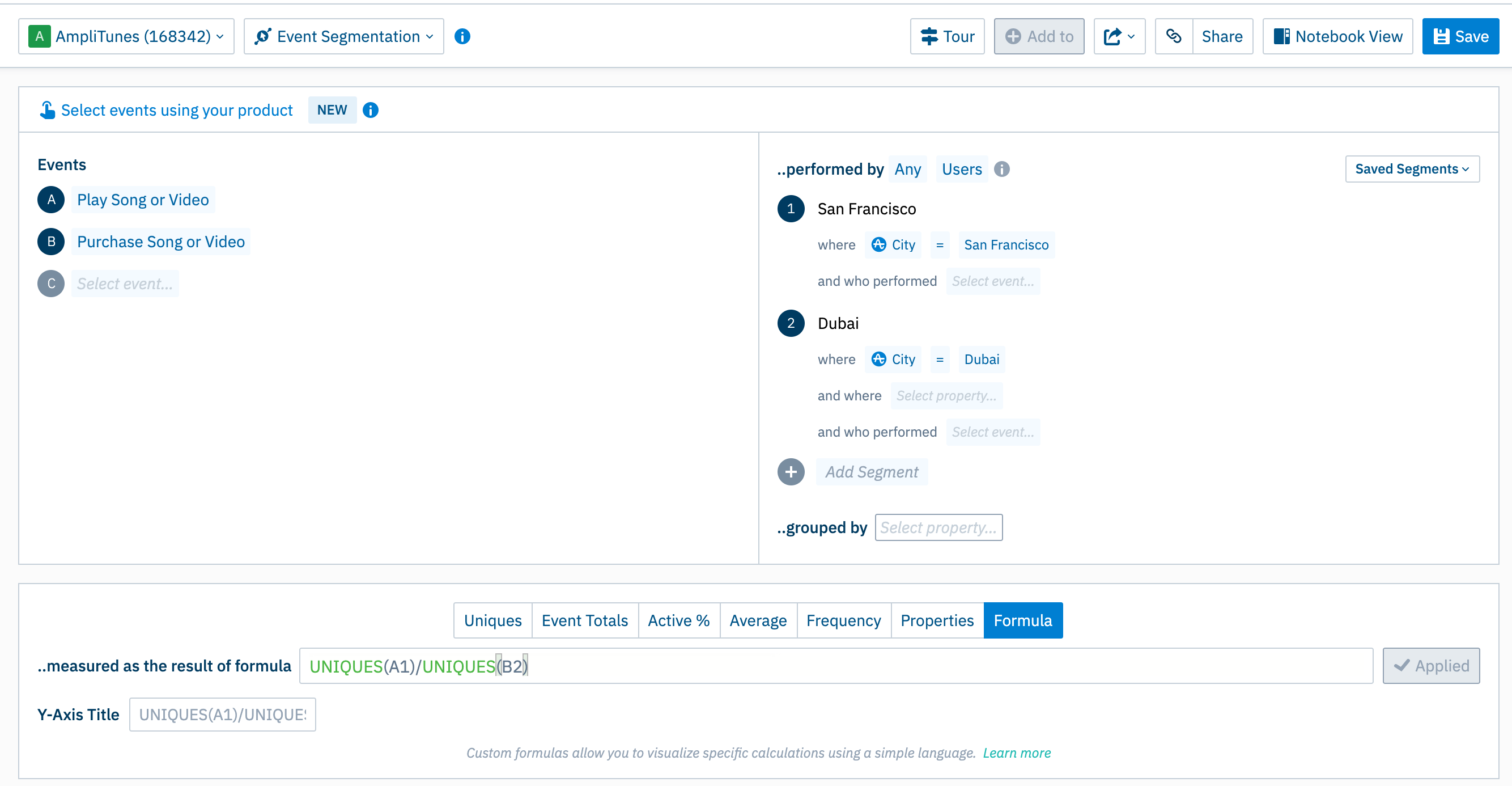
I have the same favorite feature as Daniel - Custom formulas!
Especially with our recent update that allows you to create formulas with different event-segment combinations.
Custom Formula - event-segment pairs
Previously, you could only use letters (events) in the custom formula which meant you could only create formulas that compared one segment to itself, but now you can specify which Event-Segment pair you’d like to include in the formula.
If you don't have an Amplitude account, you can create an Amplitude Starter account for free and enjoy direct access to the Community via SSO. Create an Amplitude account. You can also create a Guest account below!
If you're a current customer, select the domain you use to sign in with Amplitude.