Hello,
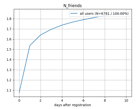
I’m new to amplitude and I’m trying to recreate a plot we made with our legacy custom analytics scripts: we’re interested in how often users performed a specific event on average (= y-axis), grouped by how many days ago the users signed up (= x-axis). With this, we want to see how the typical user lifetime looks: how many days after signup do they start doing something (on average), how many days after signup do they stop doing something, etc. Is there a way to build such a chart in amplitude?
Problem with Segmentation tool is that it just counts events grouped by calendar dates. I couldn’t find a way to make it group event counts with respect to the user’s timeline (days after signup).
I also managed to get a histogram of event counts, but I was unable to plot the time evolution of average event count, grouped by days after the user’s signup event.
Is there a way to do this in amplitude? Thanks in advance! ")
