Solved

How to display chart in "Bar chart" for each month, not the sum of all months?


Userlevel 1
Badge

Good afternoon, dear Support service!

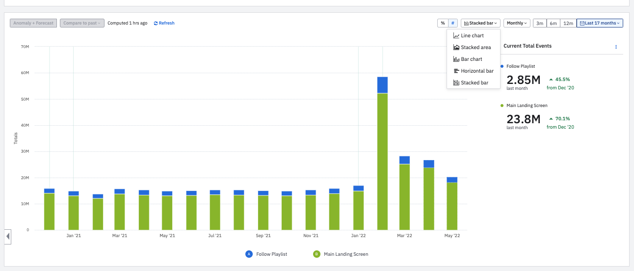
I need to display a chart that should display 2 events A and B for the last 17 months. I would like to display the chart like this https://i.imgur.com/uOXb1ue.png, but when I select "Bar chart", the values are sum up for all 17 months and only 2 bars are displayed (https://i. imgur.com/B5JxTx9.png) and not (17+17=34) as it should be. Please tell me how can I achieve the desired result?

icon

Best answer by Saish Redkar 18 May 2022, 18:14

View original

2 replies

Userlevel 7
Badge +10

Hey @sergii 

The Bar Chart view will aggregate the uniques/totals for those 2 events and the end result will be only the 2 bars.
Afaik, the visual you want isn’t possible in Amplitude i.e. a side by side comparison of the 2 event bars for each time period. But you can have this modified in a Stacked Bar View if that suits your use case. Like this demo chart.

Let me know if this helps.

Userlevel 6
Badge +8

HI @sergii ,


I do agree with @Saish Redkar here! While I do not think you can get it the exact way you want it, I do believe Saish’s response above is the best solution for you and should still get you the necessary data! I hope this helps, let me know if you need any further assistance!

Reply