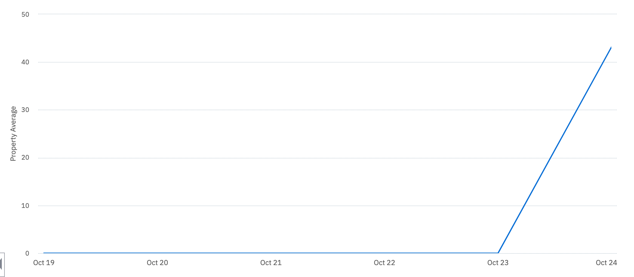
Is it possible to change the x-axis on a line chart to an event property?
Our use case is tracking an event property “value” that occurs on a “date” which is another event property. The metric corresponds to the “date” property, not to the time at which the event was created/received so we need the x-axis to be the “date” instead of the event timestamp.
Our events look like this:
[<br />{ "date": "2021-10-19", "value": "50" },<br />{ "date": "2021-10-20", "value": "40" },<br />{ "date": "2021-10-21", "value": "30" },<br />{ "date": "2021-10-22", "value": "60" }<br />]and we want to plot the `value` on the y-axis versus the `date` on the x-axis. These events may all be sent to Amplitude at the same time which means that the default line chart will put them all at the same timestamp.
Here’s a graph that shows what happens when we try to plot the data (which all arrived on 2021-10-24).