Solved

Calculating new purchasers – Can you tell me what I am doing wrong here?

  • 19 March 2024
  • 9 replies
  • 58 views

My numbers aren’t aligning when I do a manual audit

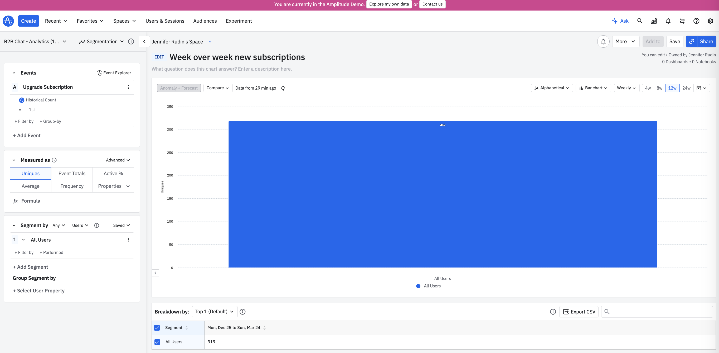
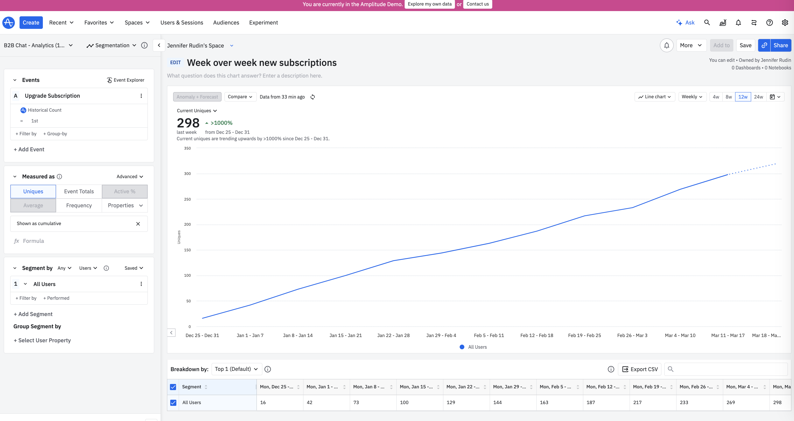
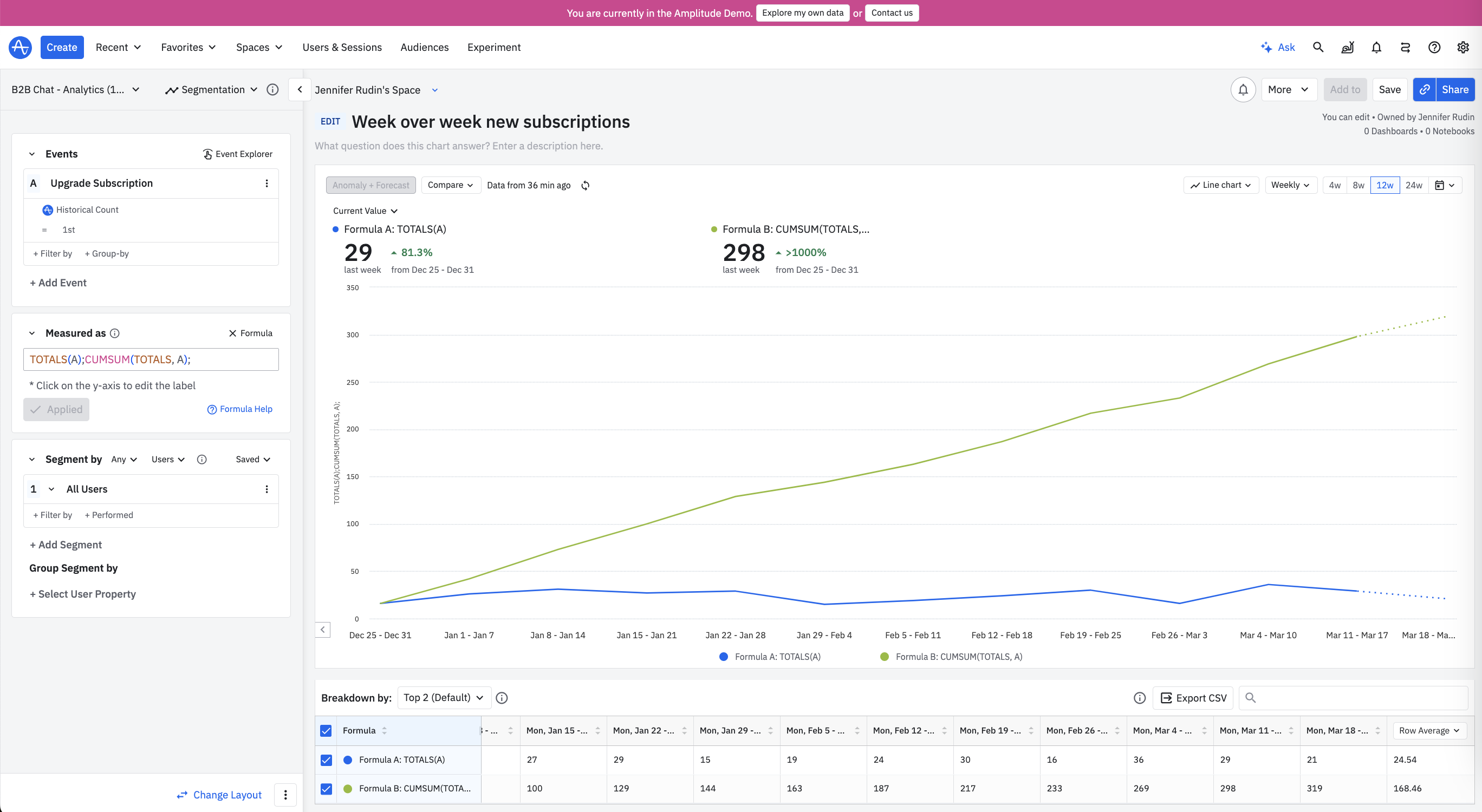
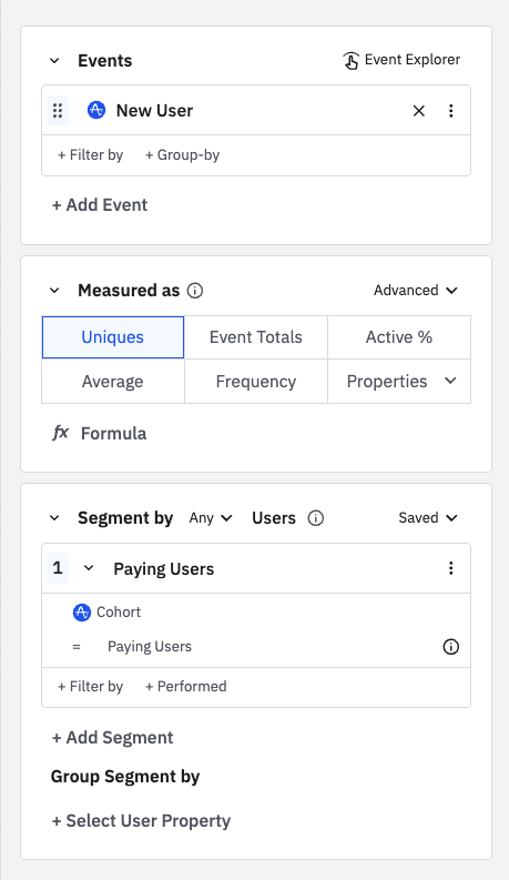
Here’s what I want to do: As stated in the tin, I want a simple graph of new purchasers. Whenever someone purchases something, I have an event called “CompletedPurchase”


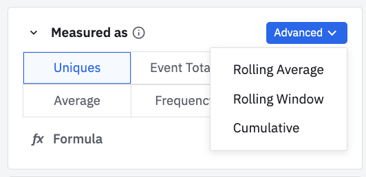
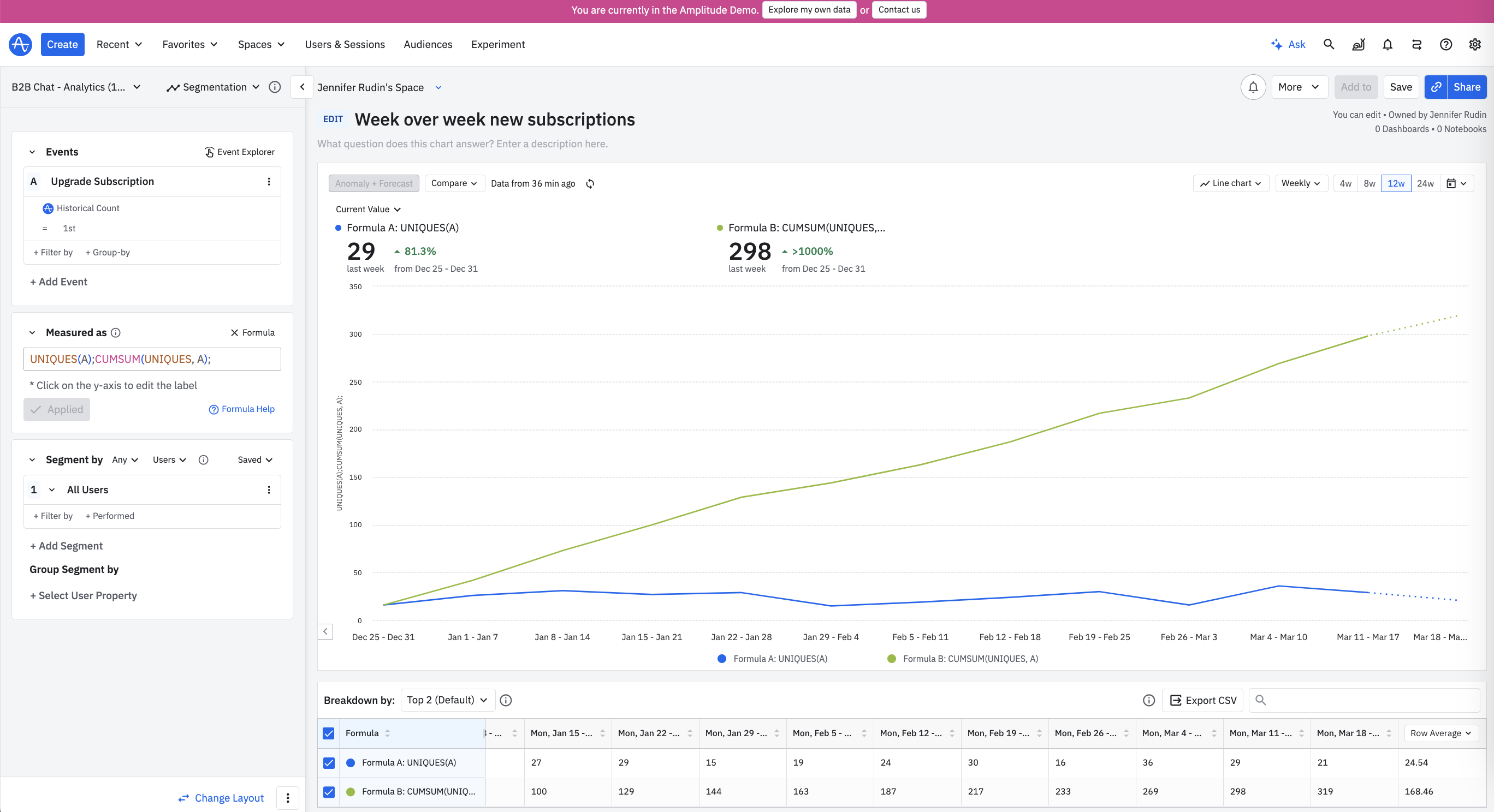
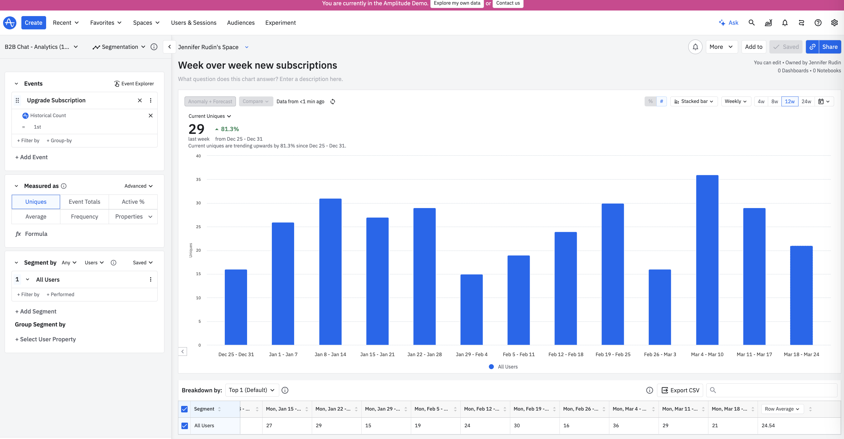
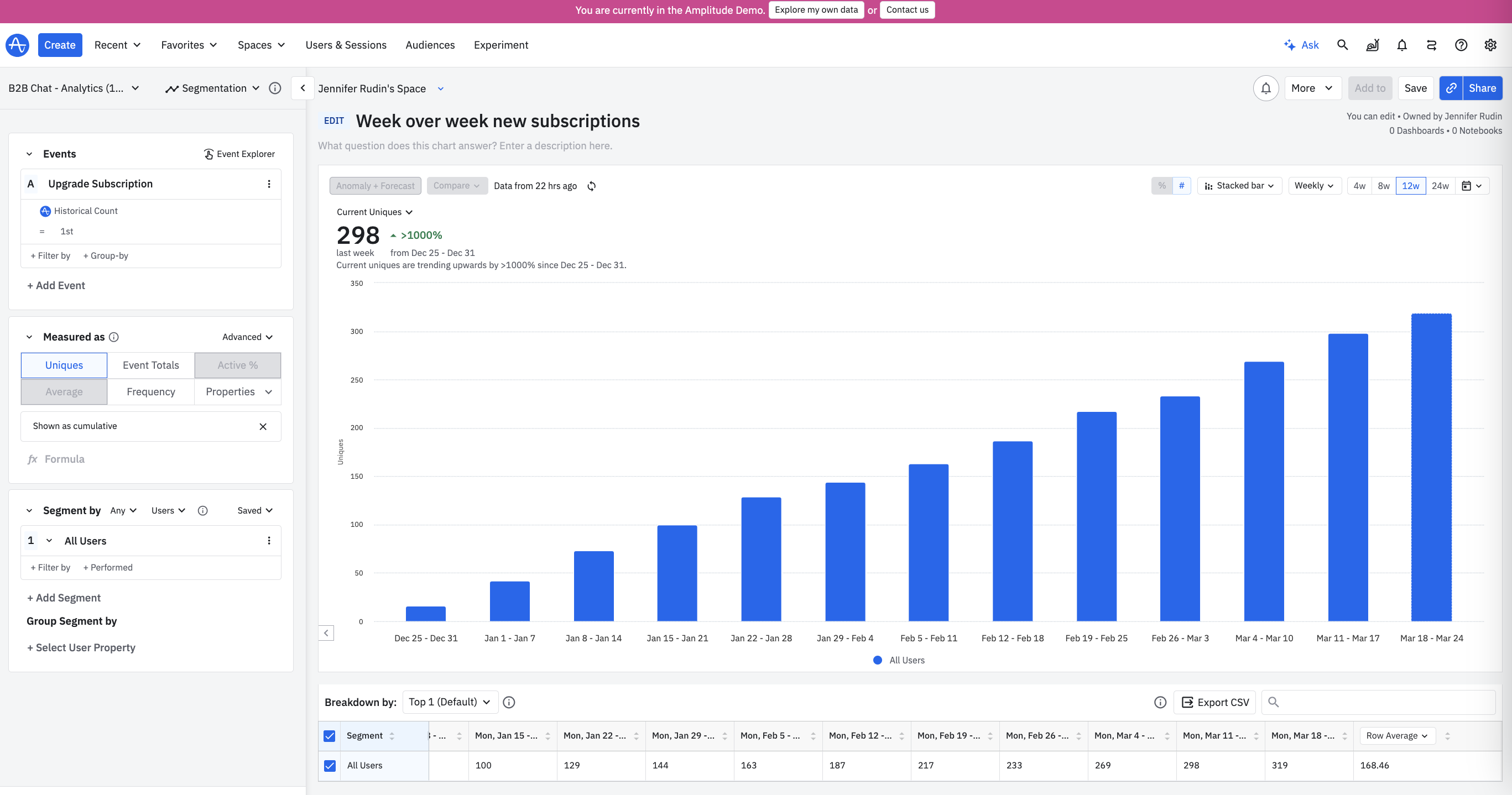
Here’s how I tried to achieve this

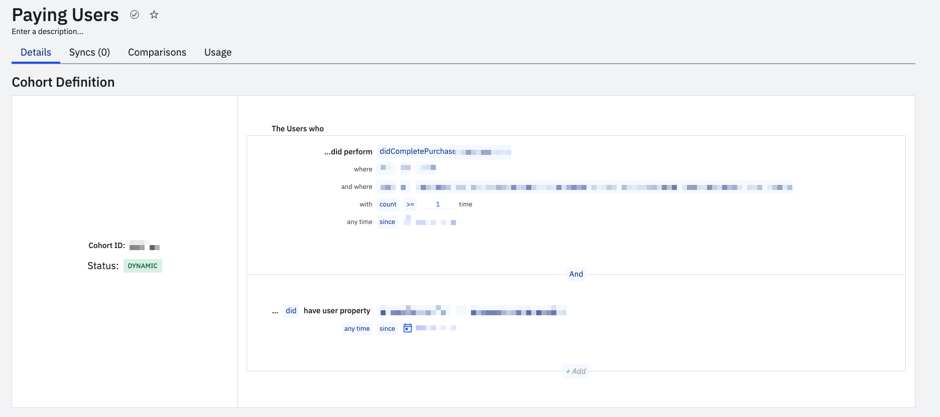
And here’s the cohort for Paying Users.
 

What am I doing wrong?

icon

Best answer by JennRu 19 March 2024, 21:54

View original

9 replies

Userlevel 4
Badge +8

Hi @quintinpar , instead of plotting New Users event, could you modify your event segmentation chart to just plot the CompletedPurchase event?

What other criteria do you have in your cohort? Since it’s blurred out I can’t tell, but can your users rebuy multiple times? If yes, are you tracking an event property in the CompletedPurchase event to identify first time buyers vs return buyers? If not, you can add to your event segmentation chart a where filter on Historical Count = 1st. 


Here’s an example chart in the demo org. I used the stack bar visual, with a weekly interval to see the count of new subscriptions week over week. 


When you update your chart, do the counts align more to your manual audit?

Thanks for the quick response, @JennRu .


Sorry for blurring the criteria in the cohort funnel, it was exposing internal info. What I have done there is exclude some items that were sold for $0 and then the date to be from the launch.


The items cannot be repurchased. Only once.


Your graph shows that you haven't used a cohort; it's just segmentation. That's nice. I did it that way, and the graph looks pretty much the same as earlier, which is interesting. I'll have to dig this further.


One more q:


If I have to plot the cumulative number in the same graph, how do I do this? Earlier, I would have used a formula with "Measured as" as TOTALS(A);CUMSUM(TOTALS, A), but now with uniques and historical count = 1st filter, how can I achieve this?

Userlevel 4
Badge +8

In your chart, you can also modify the date range to “since” the launch date

Re: items can only be purchased once, does this mean UNIQUES of CompletedPurchase event = TOTALS? 

The formula still works with filters applied to the event

In your chart visual, you can modify to a bar chart to show total count of new purchases since the date of the launch 


Otherwise if you want to display cumulative sum over a line chart, you can modify chart visual to line chart, and 2 options

  • under advanced drop down, select cumulative


  • or in the formula bar, you can verify if CUMSUM(UNIQUES, A) is equal to CUMSUM(TOTALS, A) and either do UNIQUES or TOTALS - whichever aligns best with your data use case
     

Thank you @JennRu . This helps! 

@JennRu 
When I tried to change the line graph to bar chart, everything got clumped into a single bar line? How do I avoid this and this as a time interval on x axis?


Userlevel 4
Badge +8

Hi @quintinpar apologies if that wasn’t clear in the above message, the bar chart aggregates the formula (UNIQUES, or TOTALS, or something else) over the full date range interval - in your screenshot above over the course of 30 days. 


If you wish to visualize the data in brackets of bars across a daily x axis interval or weekly or monthly etc. x axis interval, you can modify the visual to stacked bar; however the big caveat with the stacked bar visual type is that it is unavailable for a formula that is typed out. (I’ve submitted feedback to product to fix this, as I’m not clear if it’s a feature limitation or a “blind spot” that wasn’t correctly implemented.)


However if you need to show cumulative, you can use the advanced drop-down filter and then select the visual to be stacked bar like in this chart edit


Let me know if this helps

Thanks @JennRu  . But if I use the advance drop down filter, I can do two graphs together, right?

I used the formula so I can do and uniques and cumsum of uniques together.

Userlevel 4
Badge +8

Ah yes, @quintinpar a caveat with the advanced drop-down filter is you are limited to 1 formula - just cumulative users. 

Could you create 2 different charts and look at them side-by-side in a dashboard view - one for cumulative, and one for UNIQUES, so that each chart can be visualized with the stacked bar chart?

Yup, I’ll live with that limitation. Thank you very much.

Reply