Solved

Am I missing the ability to use color as a distinguishing factor for visuals?

  • 31 July 2023
  • 1 reply
  • 161 views

Badge

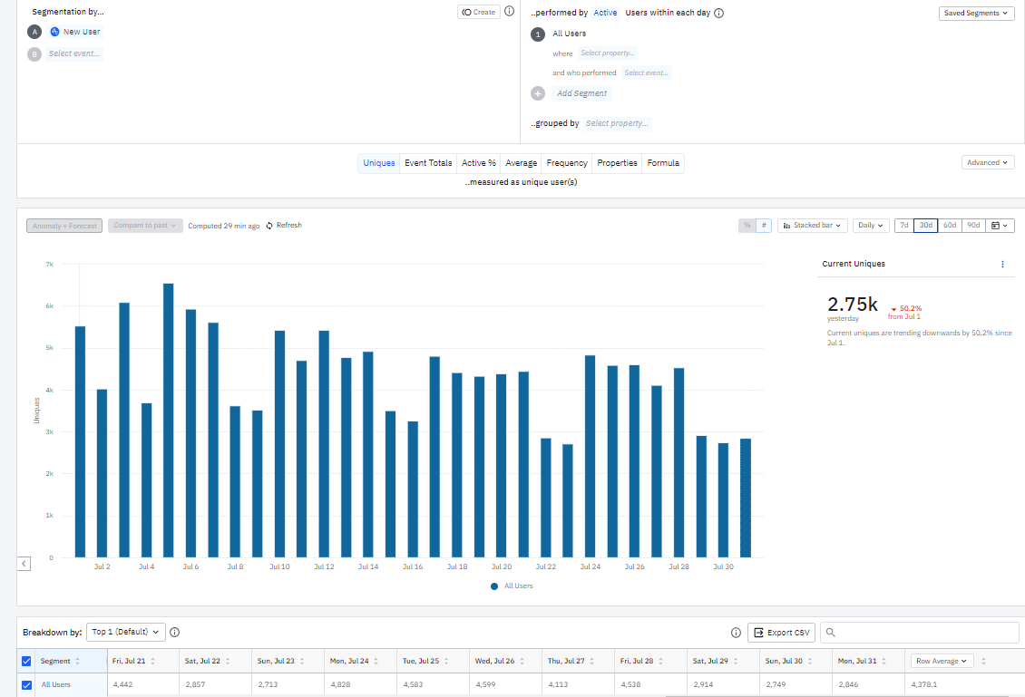
How would I distinguish time periods by color in a chart?  Since it's 1 segment on a daily chart for 30 days, I'd like to highlight each day of week (Mon-Sun) a different color, with up to 7 total.  I don't seem to see that ability within the charts.  

Initial community searches for “color” don’t seem to pull up a relevant page. 

Also, this is my 1st post, Amplitude data only went live for our web analytics June 28!  


icon

Best answer by dangrainger 31 July 2023, 22:49

View original

1 reply

Userlevel 5
Badge +9

Hi @Herb Lau. Visual control over charts and dashboards in Amplitude is currently something that’s a bit limited…changing colours in a trend as you describe is not possible as yet. You could raise this as a suggestion on the ideas board: https://community.amplitude.com/ideas.

Dan.

Reply