Hi Amplitude community, I’m fairly new to the world of Amplitude but have been really enjoying the tooling so far :)

I’m wondering if there’s a good way to visualize user composition by frequency of usage--e.g. building a pie chart that will show a breakdown of number of users who are active on a daily vs. weekly vs. monthly basis.

I’ve been looking at the User Composition chart but it seems to only allow composition by user properties. 

Any advice/pointers would be greatly appreciated. Thank you!

Hi @dots

You are correct, the user composition chart will only allow break down by user properties.

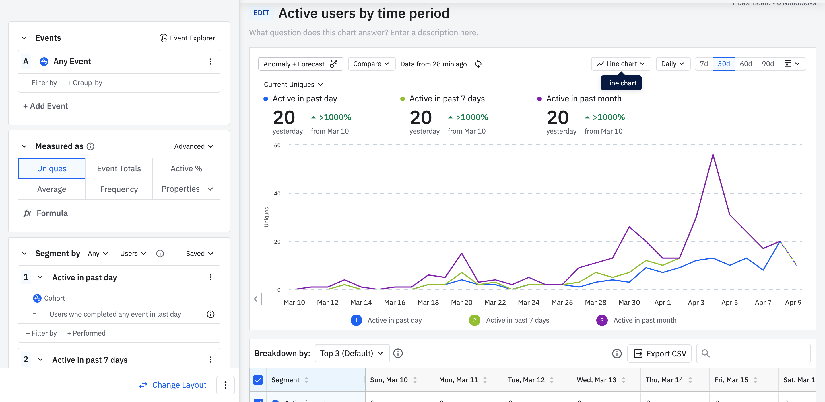
To visualize your usecase, you will have to create cohorts per your DAU/WAU/MAU definition and use them as segments in an event segmentation chart. You will need to select the appropriate chart interval so that you are capturing the time bound definitions correctly.


Hi Saish, thank you for your response!

I tried creating cohorts for users active in the last day, week, and month, and using these to segment our graph of active users over time, as you mentioned. I think this will provide the information we are looking for. Do you mind elaborating on what you meant by “select the appropriate chart interval so that you are capturing the time bound definitions correctly”?

Thanks again for your help!


Reply