Hi! One possible explanation could be that you used “this order” for defining your funnel, while user paths are always “exact order”. Between the two steps of your funnel, there could be other events that cause the drop-offs. Have you tried ‘exact order’ ?
Hi @Asja!
Yes I’ve tried with “exact order” and it yields the same result and numbers as “this order”.
Best regards,
Daniel
Well, then idk either, unfortunately :(
I also have the impression that choosing ‘any event’ as a criterium in Amplitude (e.g. for a retention analysis) is a total different thing than choosing one event that happens during each user session (which by definition should be part of ‘any event’), such as start_session, for example. I wish Amplitude could be a bit more transparent in their documentation here.
Hi!
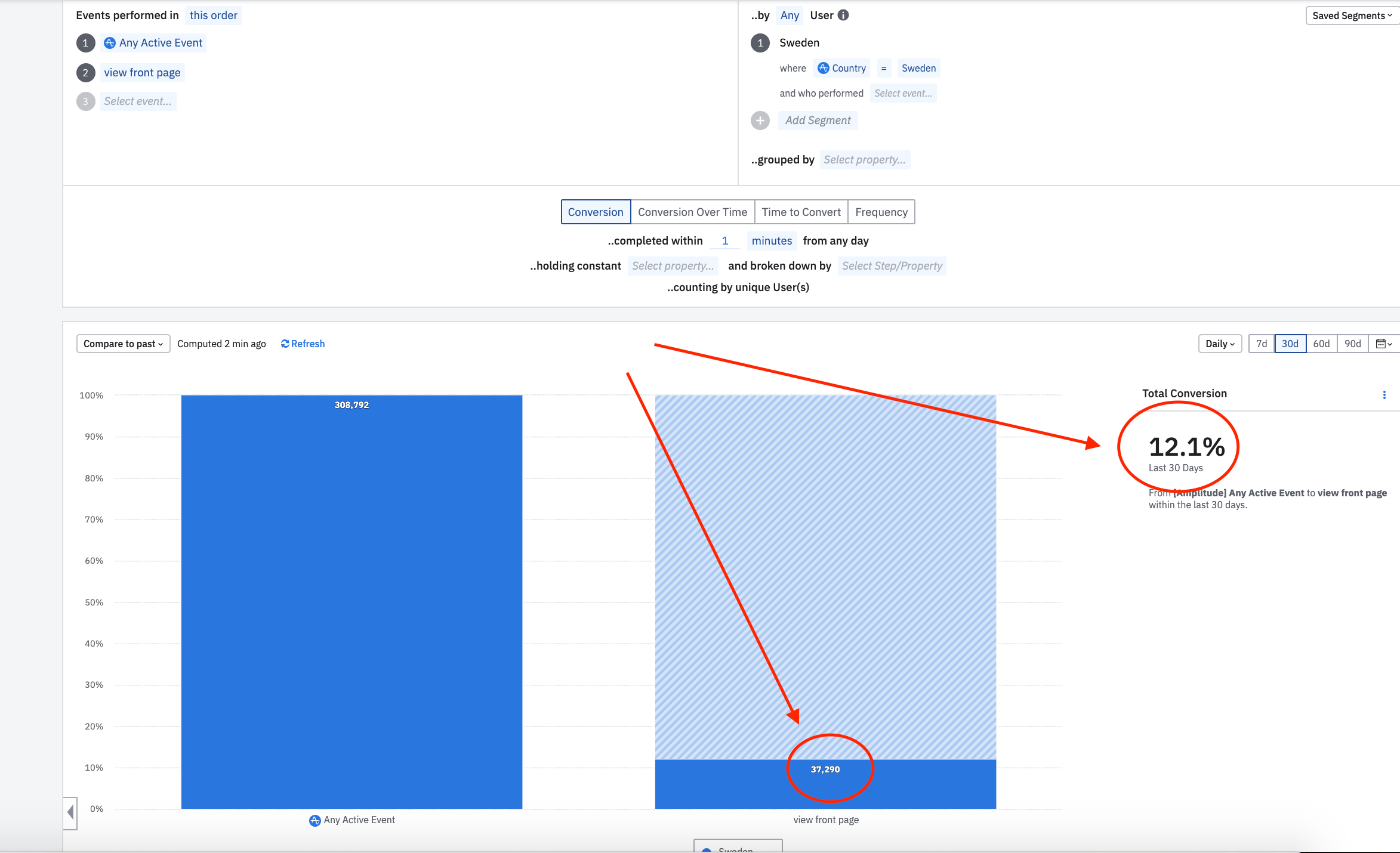
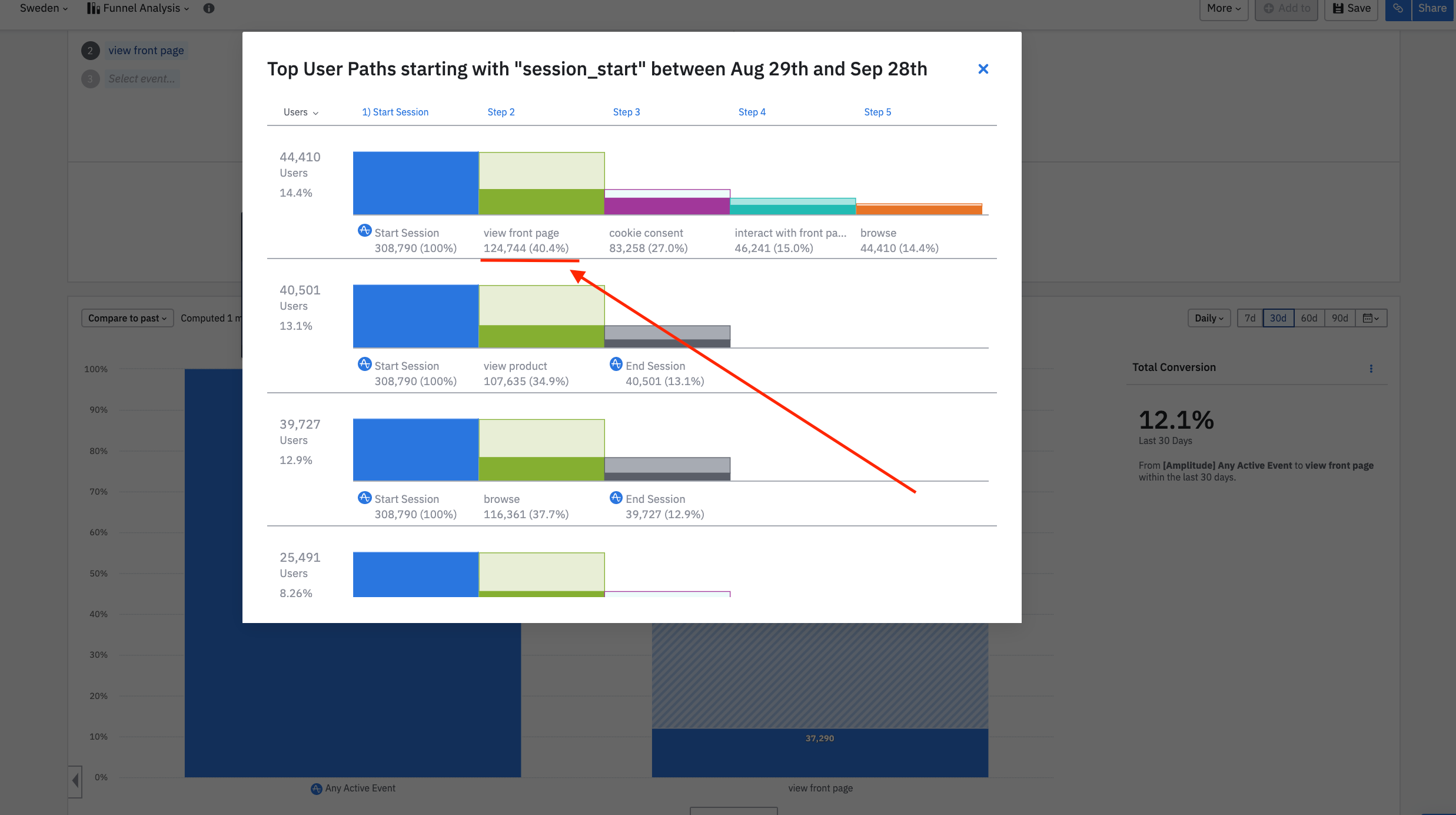
I am struggling to understand why the Funnel Analysis is showing different numbers in the chart or if you look at the ‘show user paths’ in the same chart. I’ve attached two screenshots highlighting the different numbers. I don’t understand how ‘Any active Event’ → ‘view front page’ can show 37 290 (12.1%) in the chart, while ‘Start Session’ (a part of ‘Any Active Event’) → ‘view front page’ show 124 744 (40%)?
Best regards,
Daniel
As far as I know, the user paths don’t take into account the time-to-convert definition in the funnel chart. They just show the paths users have taken, regardless of how long it took for them to navigate from one screen to another.
This is especially noticeable, since you are using very tight 1 minute time window in your funnel.
Hi!
The Funnel Analysis and Pathfinder charts are calculated differently.
Mikko is correct. It’s caused by the conversion window. Funnel queries extend the end range of a query by the conversion window. To get the same result from Pathfinder, we have to do the same thing. We do that in Journeys for example, but we don’t do it for “show user paths”.
Another way to verify this is to run the queries with a small conversion window. Funnel Conversion window slightly extends the range of the conversion and that’s why the numbers are slightly different. Let’s say your A->B funnel date range is from 6/1 to 6/10 with 1 day conversion window. If someone performs event A on 6/10 and B on 6/11, we would count them as converted. Show user paths from event B, creates a cohort from converted users and runs a Pathfinder users query starting with event B on the same date range as the funnel query (6/1 - 6/10) on the converted cohort. So it does not show any paths for the user who performed B on 6/11.
I hope this helps you understand the difference!