Solved

Bar chart not grouping by month?

  • 20 September 2023
  • 3 replies
  • 185 views

Badge


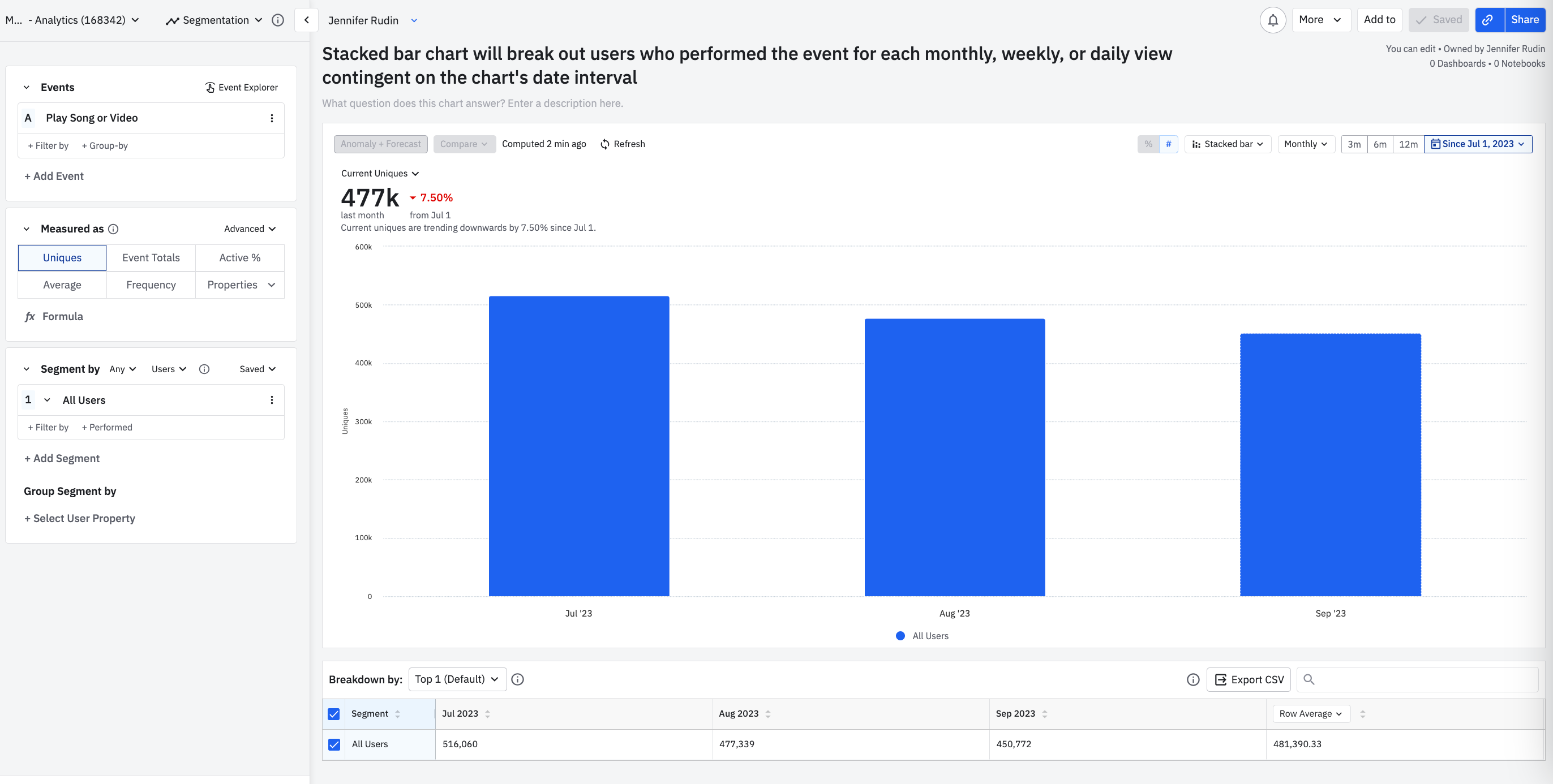
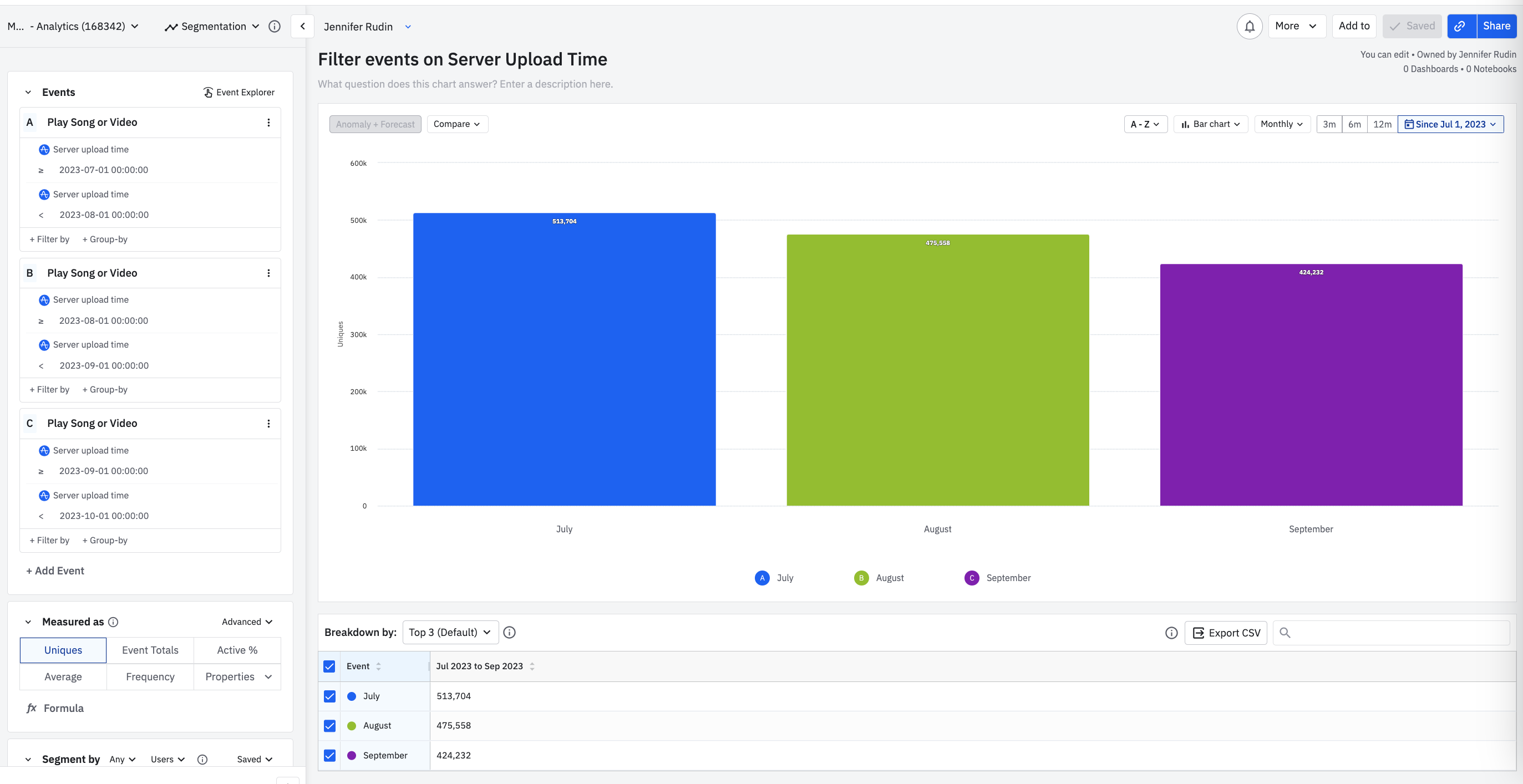
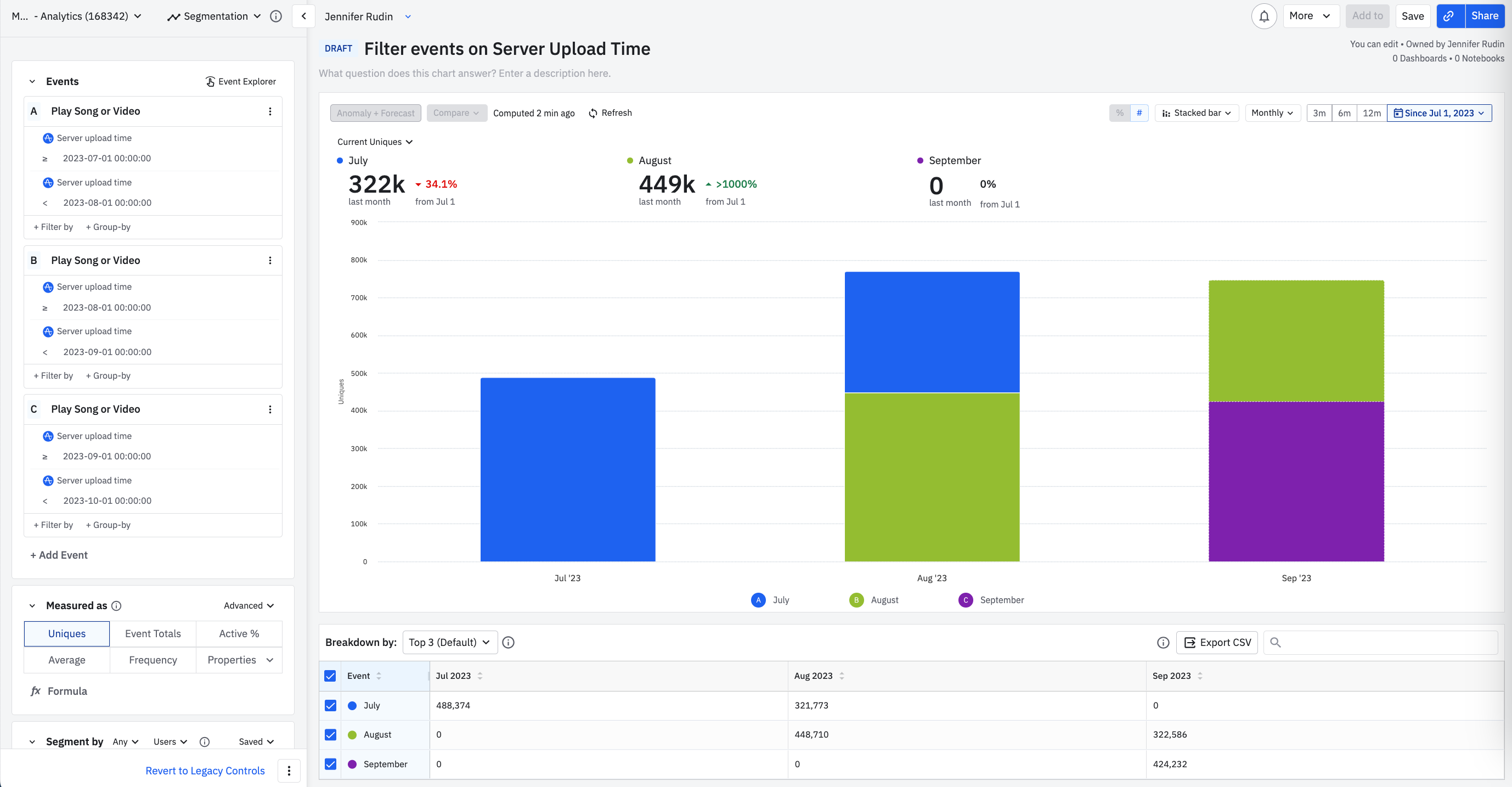
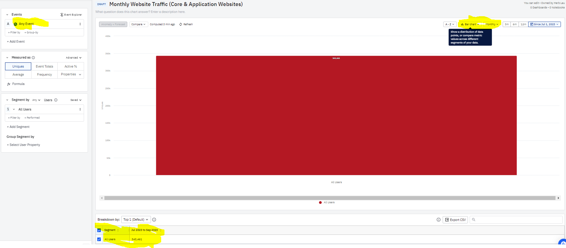
Is there a reason the bar chart doesn’t divide out into months’ data?

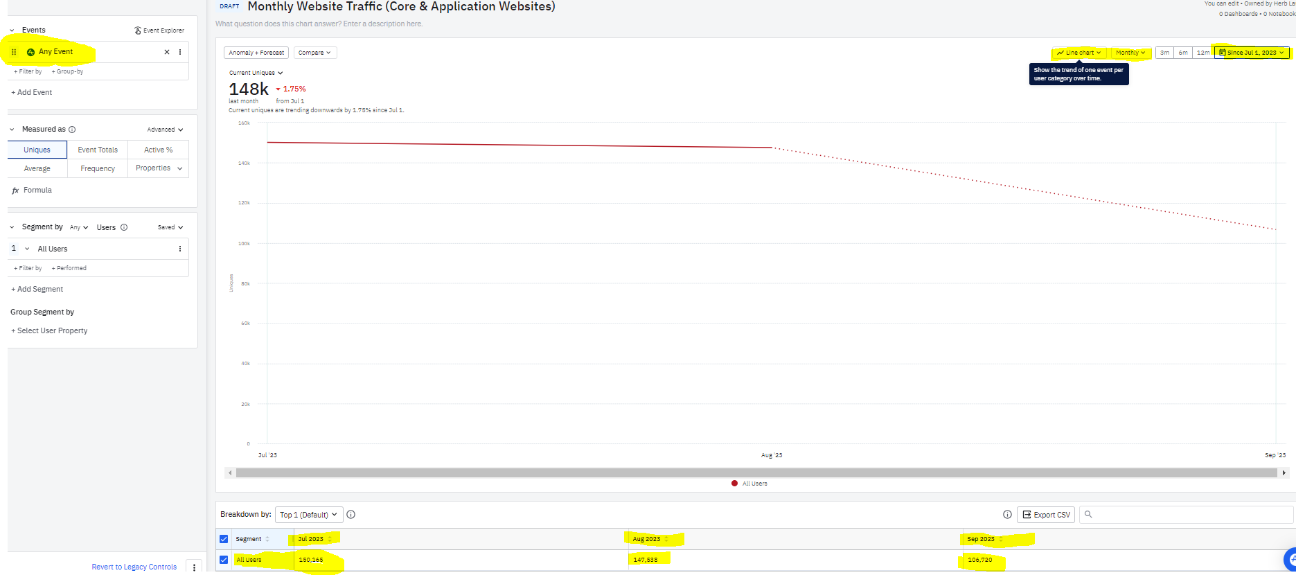
The line chart above doesn’t seem appealing visually to my end users.  

The bar chart, for whatever reason, doesn’t seem to want to divide into groups based on the month.

The time controls at top right are for Since July 1, so for the current day, I’d hope for July, August, September, with September having less since it’s a partial month.  There also don’t seem to be Amplitude event properties based on the time stamp of the event visible within the event options, so I can’t run some kind of calculated field on the month of the time stamp.

The 2 time options available for Group By seem to be Hour of Day and Day of Week, which are nice to know, but not as helpful to the end user.  

icon

Best answer by JennRu 20 September 2023, 22:10

View original

3 replies

Userlevel 4
Badge +8

Hi @Herb Lau thank you for sharing these screenshots. Have you tried plotting the chart visual as a stacked bar? This will display the count of users who performed the event as a bar for each respective month in your chart. 

Here’s a sample chart in the Amplitude Demo. I included screenshots below if you have any issues opening the link.


Use Stacked Bar chart visual in Event Segmentation to breakdown view per time interval e.g. monthly, weekly, daily, etc.


For your question on timestamps, Amplitude collects and enables filtering on the Server Upload Time, which is the timestamp that Amplitude received the data. So if your org is backfilling any historical data, the server upload time will display when the data was ingested in Amplitude, not the backdated timestamp. But you can use this for filtering for each month’s ingested event counts. 

Sample chart: https://app.amplitude.com/analytics/demo/chart/y7csixu6

User Server Upload Time to see specific bars of users who performed an event for each month, based on Amplitude’s event ingestion time recorded.


Note: You’ll visibly see if your company is backfilling data if you use the Server Upload Time filters from the chart above and switch to a stacked bar chart and see multiple colors for each month, like the screenshot below.

This demo org is backfilling data for July in the month of August, and for August in the month of September.


Let me know if this helps, thank you

Badge

@JennRu Thank you, stacked bar did it, that was the one I didn’t try. 

That being said, why would stacked bar fix it? 

the logic doesn’t fit, since each bar doesn’t need to be divided into groups.  

Userlevel 4
Badge +8

Hi @Herb Lau , this response clarifies the difference between bar chart vs stacked bar. 

Stacked bar visual will chunk out the data horizontally to reflect the uniques or totals buckets for each time interval (daily, weekly, monthly, etc.) on the x axis. Additionally, it will break up the data vertically if you add more events, segments, and property group-bys to compare the distribution against each of the time intervals on the y axis. 


This means if User A did Event B in July and September, this same user will count as a unique user in both the monthly July bar & monthly September bar in the stacked bar visual. 


Meanwhile bar chart visual will plot the aggregate unique or total count from the full time window. When you add more events, segments, and property group-bys to the chart, it’s graphed as more aggregate bars along the x axis. 


Now if we look at User A, they will only show up once as a unique user in the aggregate bar chart visual for the full time period.

Reply