Events performed in this order: 1) Home Page Shown 2) Clicked About Us Button
Funnel 2:
Events performed in this order: 1) Home Page Shown 2) Clicked Contact Us Button
Now I want to create a chart that compares Clicked About Us Button to Clicked Contact Us Button and gives me the distribution in percentage. Can someone please help me with this?
Page 1 / 1
Seems like Pathfinder is a way
hi @sagarsoni7 , did Pathfinder work for you?
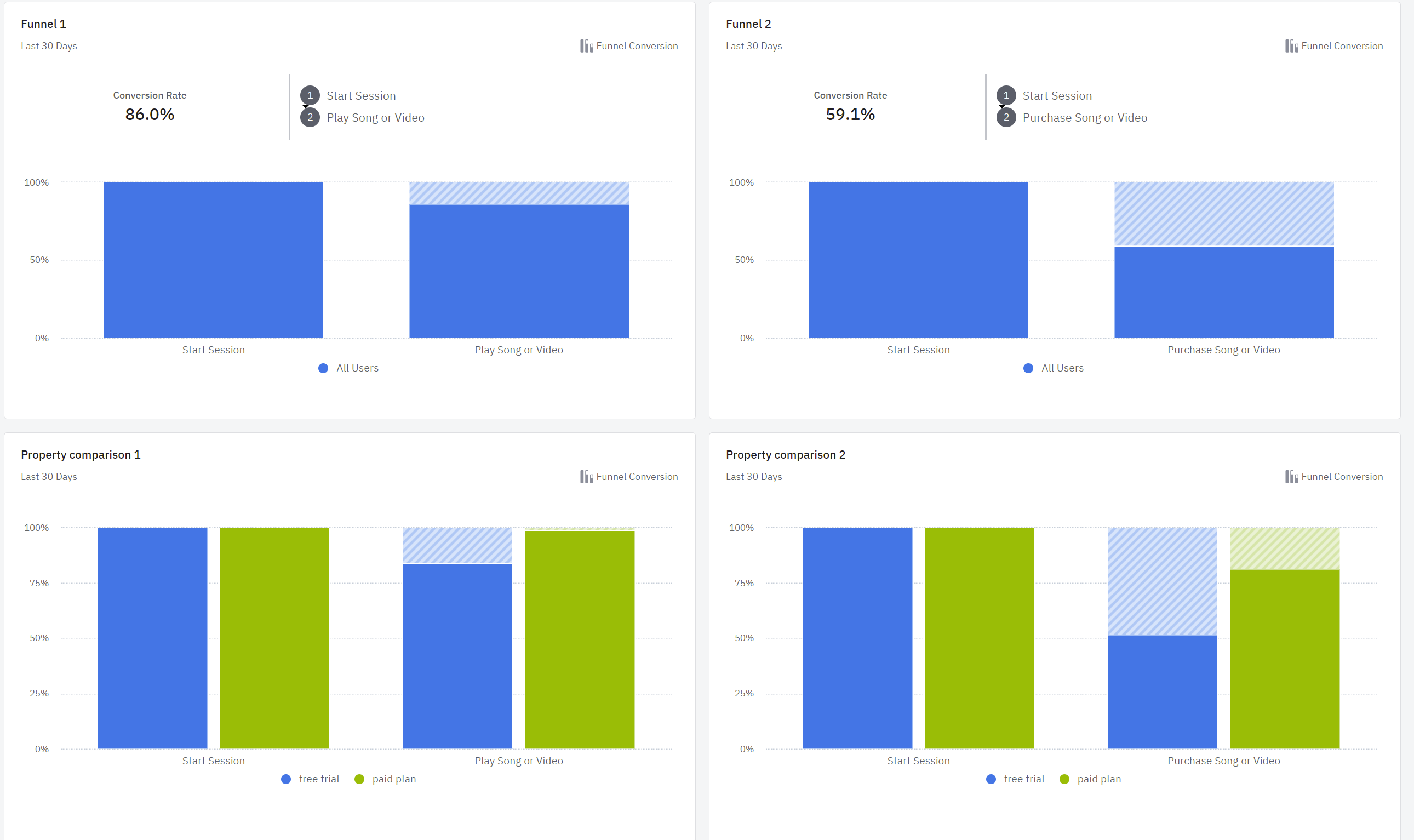
another option is to build two different funnels as you describe in your comment, and then posting both on a same dashboard and making visible the percentages as in first row of my screenshot, (Funnel 1 and Funnel 2)
the second row would be an option if making a comparison of properties within a single event rather than a comparison of multiple events (seems like this is not your case),
hope it helps,
Hi @Tatiana, I couldn’t give Pathfinder a try since it isn’t available in my current plan.
Adding funnels to a dashboard make it comparatively easy to compare, thanks.
Do you happen to know if I need to set duration of both funnels myself or the dashboard auto sets it? Else one of my funnel would be showing data from Last 1 day and other could display from Last 30 days
Hi @sagarsoni7 ,
Glad to see @Tatiana answered your question! You would need to set the duration of both funnels yourself and save the charts.
Hope that helps!
Kind Regards, Denis
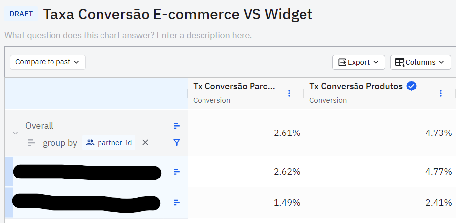
Hello @sagarsoni7, If you ar not intend to see the grafic you coul built a table chart.
I make my funnels side by side in a table, check this out:
If you don't have an Amplitude account, you can create an Amplitude Starter account for free and enjoy direct access to the Community via SSO. Create an Amplitude account. You can also create a Guest account below!
If you're a current customer, select the domain you use to sign in with Amplitude.
If you don't have an Amplitude account, you can create an Amplitude Starter account for free and enjoy direct access to the Community via SSO. Create an Amplitude account. Want to sign up as a guest? Create a Community account.
If you're a current customer, select the domain you use to sign in with Amplitude.