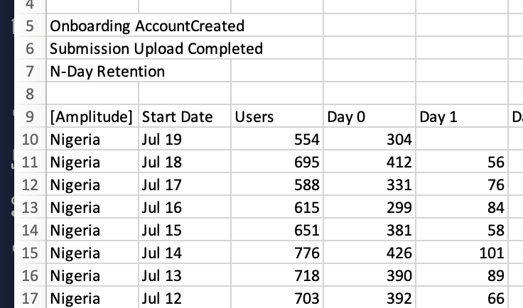
Hi, I’m having an issue where I’m viewing several countries by N-Day Retention rate, however, when I export the CSV, the data seems poorly laid out. 

In the chart within Amplitude, it shows the cumulative number of users for each day (and the % of users that retain each day e.g. Day 0, 1, 2, etc). This is show on a single line cumulatively (e.g. if I’m looking at new users from dates June 1 - June 7, the chart shows all of these users added together, which is helpful).

However, when I download the CSV, it parses out each individual date of the between range, making the process to play with the cumulative data prohibitively cumbersome. Does anyone know if there’s a way to download what I see from the chart within amplitude instead? Screenshots below of both the within-Amplitude chart and the CSV output.

Thanks!


Hey @cfreymeyer 
I think this is the default behavior when exporting a retention chart - each group by value will be laid out with every date’s retention numbers in the chart’s interval.

I know there are tools out there which can extract csv from a jpg/png image. Maybe that can help you get the single line cumulative view as seen in the UI breakdown table.


I think this could be a good feature request which you can submit in here.


Thanks @Saish Redkar - yeah just seems odd they would show the *very helpful* aggregate chart, but then make you export a CSV that delivers the data differently 😞 good point on requesting the feature. Thanks! 


Hi @cfreymeyer ! This is Belinda from Technical Support team here at Amplitude 👋 I just wanted to quickly follow-up that the exported CSV that you see is expected. The exported CSV is reflective of the breakdown table which breaks down each individual date of the between range. That said, I see how surfacing the cumulative aggregated values would be beneficial as well so please do put this through as a feature request! Thank you for providing your feedback which help improves customer’s experiences like yours! 😊


Reply