Solved

Event pie chart segmented by event properties

  • 18 June 2021
  • 6 replies
  • 1297 views

Badge

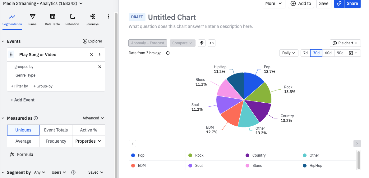
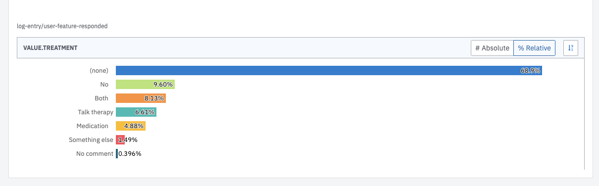
I have an event with different properties (single choice results). As an end result, I’d like a pie chart with 100% being the uniques and the percentages related to how many users have a specific event property. Couldn’t figure it out so far and would appreciate some help.


icon

Best answer by Saish Redkar 18 June 2021, 16:29

View original

6 replies

Userlevel 7
Badge +10

Hey @timediver 
Currently, the only pie chart visual supported in Amplitude is the User Composition chart, wherein you can only leverage a user property to see a percentage comparison.

The closest thing which I think can help in your use case will be an event segmentation chart where you group by your event on that desired event property and then leverage the “Group By “ visualization.

You can then switch between # Absolute and % Relative to see the comparison between the event properties of just that event.


Here is a sample chart from the demo AmpliShop project which uses the Completed Profile event and the Promo Code Applied event property.

Also, if you think an event property pie chart is more suitable for your needs, you could suggest an Idea for a feature like this!


Let me know if I have interpreted your question correctly. Hope this helps!

Badge

Thanks @Saish Redkar, that does help a lot. Is there any way to remove specific properties from the view. Given that the event itself is used for other event properties as well, the most common event property is “(none)”, which obvs distorts the results. 


Badge

Nevermind, I excluded it in the event filter :ok_hand:

Userlevel 6
Badge +9

@timediver  hey, from what I read here it seems that this would be the case of a feature request. If you have some feedback that you want to share with us, you could do so in this part of the community, where other users can also vote on your feedback as well. Link here: https://community.amplitude.com/ideas

@timediver  hey, from what I read here it seems that this would be the case of a feature request. If you have some feedback that you want to share with us, you could do so in this part of the community, where other users can also vote on your feedback as well. Link here: https://community.amplitude.com/ideas

I am still bit perplexed that what is likely the most popular type o char, the “pie chart” is not supported. That is bit sad as that is the one that represents the best the split between various groups.

Userlevel 6
Badge +9

Thanks for circling back, @ssbarnea. I’m Jeremie, the community manager 😁 Do you have what you need? We have a monthly cadence of updates to stay in the loop with the latest news and information about Amplitude’s products. Here’s more info. 


Reply