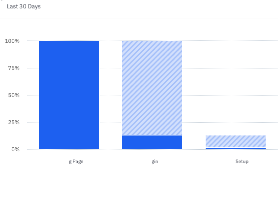
For some reason my x-axis titles are getting cut off when I insert a funnel chart into a dashboard. Does anyone else have this problem? It does not seem to be a character limit as the left-most label is showing part of a character (the right portion of the letter N). The two x-axis titles in the screenshot should show “ONBOARDING_LOADING” and “OnboardingWelcome.”


