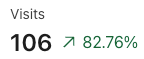
I’m relatively new to Amplitude so maybe I’m being a bit daft, I’m trying to add some “tiles” to a dashboard, with a single number, e.g.:
It seems I’m only able to create charts when I click on analysis. I love the powerful features, but also want to have a simplified at a glance view of things.
Thanks,
Ricardo
Page 1 / 1
Hi Ricardo!
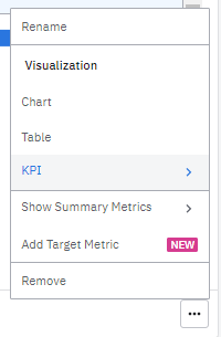
Once you’ve put a graph in a dashboard, you can click on the bottom-right corner of your “tile” (within the dashboard):
Then, you will get some visualization options that includes “KPI” and “Show Summary Metrics”, allowing you to display single numbers or numbers alongside your graphs.
Those options are not available on every charts, but should work with segementation ones
Thank you! It’s so confusing the definition happens in one place, and the display happens in another place. I get why you’d want to decouple the two, but from a UX perspective it makes very hard for the user.
Appreciate your help
Thanks for jumping in here @Matrak!
Hi, has there been any progress on more types of KPIs? Showing an average or a sum of a property is a common and very useful KPI, but when I create a chart with one of those calculations it’s not possible to change it to a KPI on a dashboard. :(
If you don't have an Amplitude account, you can create an Amplitude Starter account for free and enjoy direct access to the Community via SSO. Create an Amplitude account. You can also create a Guest account below!
If you're a current customer, select the domain you use to sign in with Amplitude.
If you don't have an Amplitude account, you can create an Amplitude Starter account for free and enjoy direct access to the Community via SSO. Create an Amplitude account. Want to sign up as a guest? Create a Community account.
If you're a current customer, select the domain you use to sign in with Amplitude.