
I’ve created a stacked bar chart that displays the event total for a particular event. When I choose a set date range (since September 6th) and count up the total events in the graph I get a different number when it’s set at daily vs. set as weekly. Counting up the bars - daily totals 73, weekly totals 138. Why is there a disparity? Surely the total number of events in the time period should be the same?

Userlevel 7
 +10
+10
Hey
Switching from daily to weekly changes the granularity on how the event uniques are aggregated in individual bars in the chart.
https://analytics.amplitude.com/demo/chart/new/r6ms4ni - In here, each bar represents a day since Sept 6 and the uniques for that event for each of those individual days.
vs
https://analytics.amplitude.com/demo/chart/new/tennyug - In here, each bar represents a week since Sept 6 and the uniques for that event for each of those individual weeks.
If you are just looking at the aggregate total for a time period, then a simple bar chart view should help.
Let me know if I am interpreting your question correctly.

Userlevel 5
+3
This does sound like you are looking at unique users (Uniques selection in the buttons above the chart) instead of event totals (Event Totals selection). In this mode, each user is counted only once, no matter how many times they performed the chosen action. So if someone triggers your event on four days a week, on the daily level they are counted once for each of those days, but on the weekly level only once.
The example graphs linked by Saish Redkar demonstrate this nicely. If you switch the view on those from Uniques to Event Totals, the numbers between daily and weekly match:
Daily: https://analytics.amplitude.com/demo/chart/new/n20iv7h
Weekly: https://analytics.amplitude.com/demo/chart/new/hrix803
Thanks for the feedback but I am definitely looking at Event Totals - see below 2 screenshots for the disparity - the only difference is that weekly has been toggled to daily:
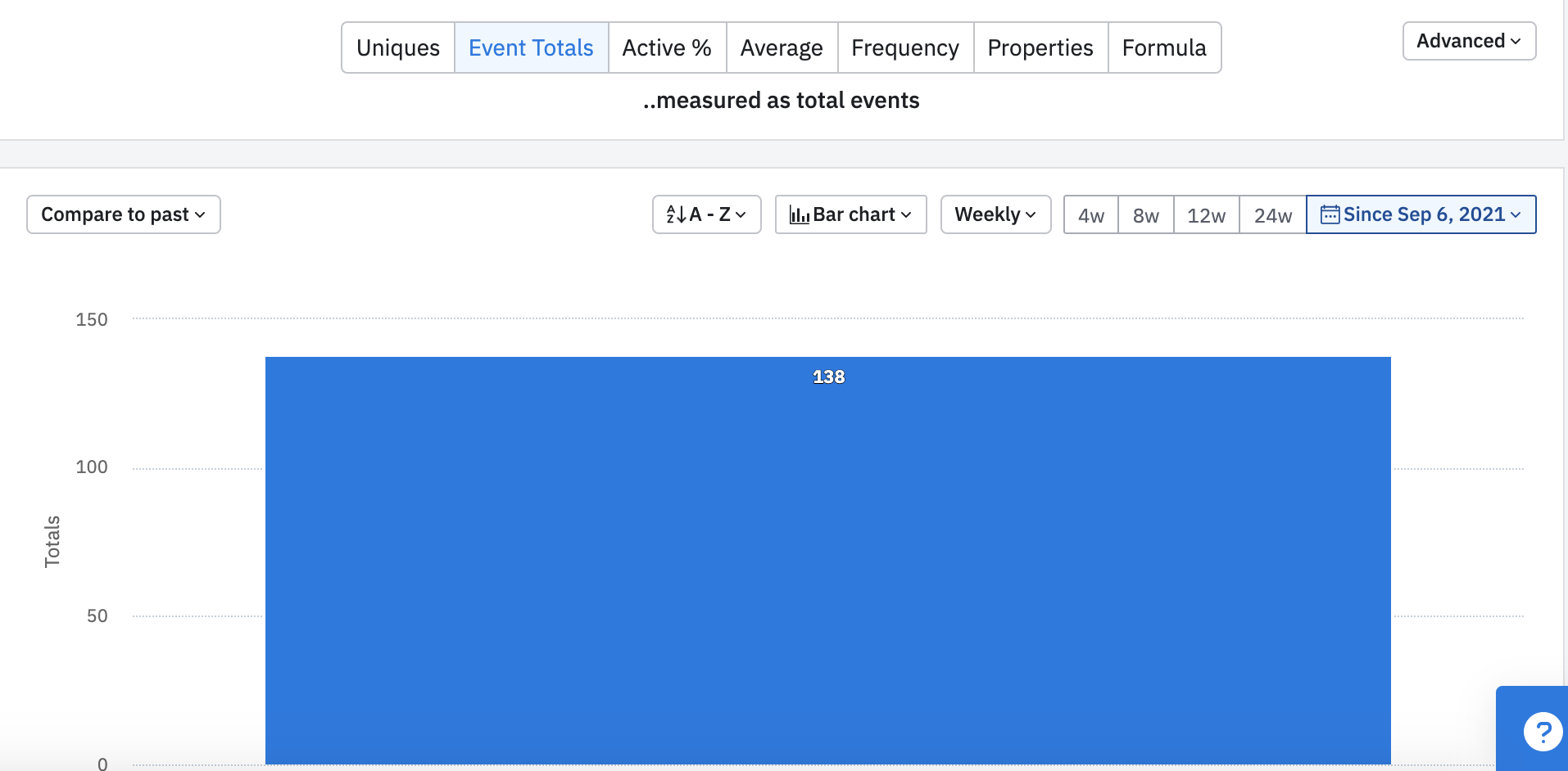
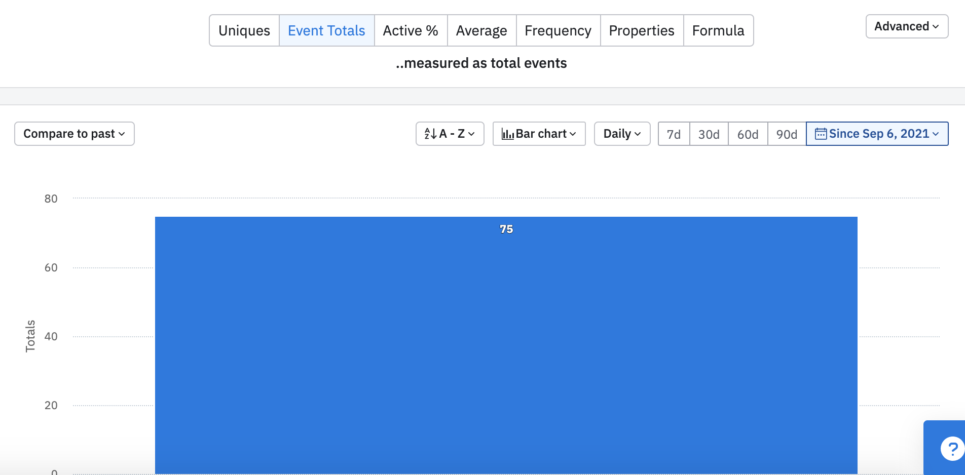
If it were to do with unique aggregation, I would also expect the daily view to be showing a higher total than the weekly...
Userlevel 5
+3
That does look very unusual. I duplicated the same charts in our projects and didn’t see anything like this.
Does the same happen with other events you have?
Do you see the same if you look at the line graph instead and sum up the numbers?

Userlevel 5
+5
Big thanks to both
Hi
Thanks for bring this to our attention. I had a close look at the screenshots and I was unable to explain what caused this behaviour. I would like to ask my Community Admin colleagues to convert this post to a support ticket. Then we will contact you via your email address to collect necessary chart for further investigation.
I hope it’s ok with you. Please do not hesitate to reach out if you have questions in the meantime!
Best,
Yuanyuan
Userlevel 5
+5
Hi
Are you looking at the measure “Uniques” or “Totals”?
As our community star users Saish and Mikko mentioned in this post, when looking at “Uniques”, this can happen due to how uniques are aggregated in different intervals. In case you are looking at “Totals”, please let me know! I will need to contact you via email to get the charts you are looking at, then we go from there!
Reply


Welcome to the Amplitude Community!
If you don't have an Amplitude account, you can create an Amplitude Starter account for free and enjoy direct access to the Community via SSO. Create an Amplitude account. You can also create a Guest account below!
If you're a current customer, select the domain you use to sign in with Amplitude.
analytics.amplitude.com analytics.eu.amplitude.comor
Welcome to the Amplitude Community!
If you don't have an Amplitude account, you can create an Amplitude Starter account for free and enjoy direct access to the Community via SSO. Create an Amplitude account. Want to sign up as a guest? Create a Community account.
If you're a current customer, select the domain you use to sign in with Amplitude.
analytics.amplitude.com analytics.eu.amplitude.comor
Enter your E-mail address. We'll send you an e-mail with instructions to reset your password.