Hey!I want to know which users coming back to my app after 2 weeks/3 weeks/4 weeks after their first visit.
How can i create this chart?
Hello Nate ! You can use the “retention” chart to display the new users (using Amplitude’s “New user” event as the starting event) who returned at a later date (using “weekly” to get the retention per week). Here is an exemple using Amplitude demo: https://analytics.amplitude.com/demo/chart/new/9s7jn2n?source=copy+url
Hope I could help 😄Matrak
Matrak
Thank you so much!
I have a follow up question:
On day 3 i have 6 out of 69
On day 7 i have 2 out of 60
What is it this “out of” 69 and 60? Its not the total users from the first day? and if it is why the number not the same?
Hi Nate !I believe this is linked to the granularity of the chart. To get the weekly retention for the same population, you need to use a custom date range (using “between”). Otherwise it seems to be taking new volumes of new users each week.I hope I’m right 😂
Thanks!I did it here!It still shows me different “of” numbersAny additional ideas why?
Week 1 - 5 of 57
@week 2 - 5 of 40
Nate This seems to be related to the length of your date range which is over a week. For instance, let’s take a 3 weeks long date range that you analyze weeky (thus computed using a 7 day-window):
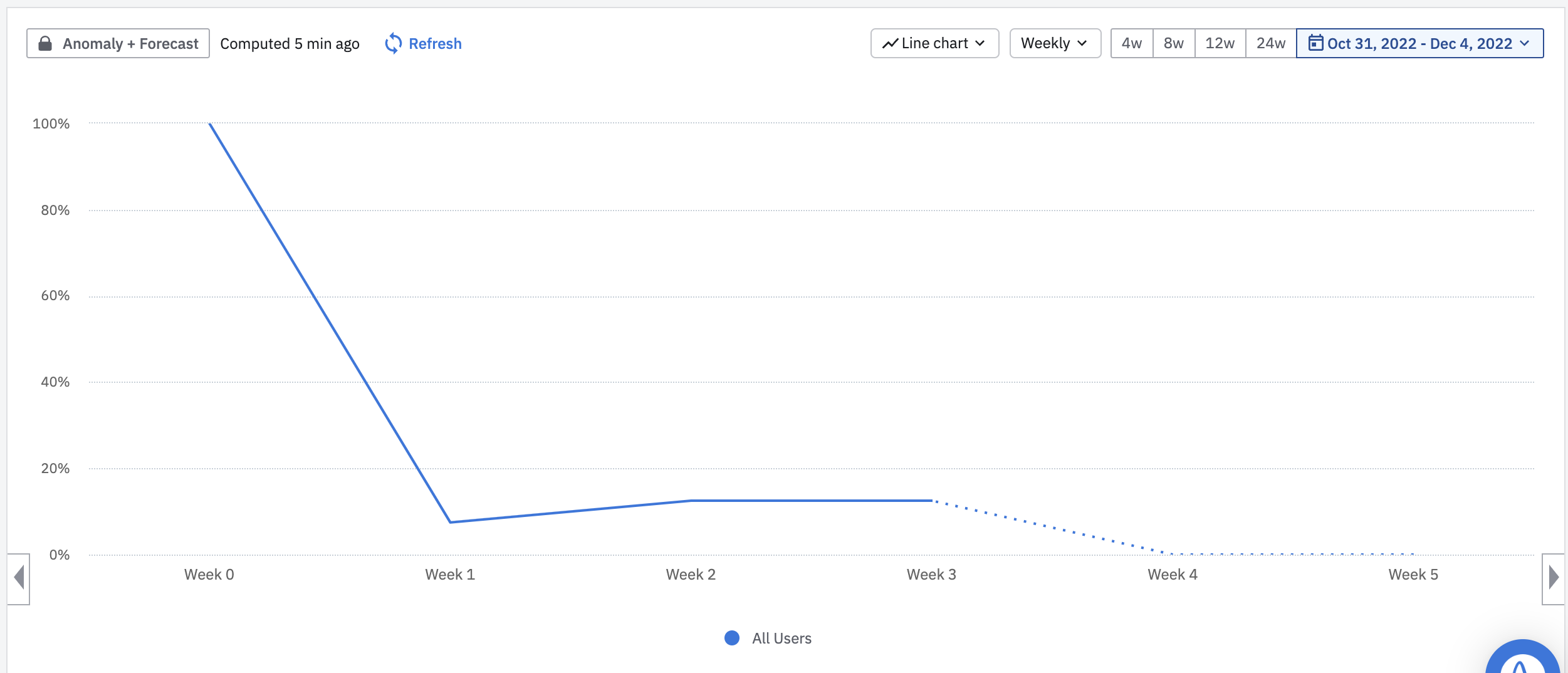
Here’s an example on Amplitude demo: https://analytics.amplitude.com/demo/chart/new/av8cflw?source=copy+urlI concluded by thinking that the amount of “rolling time window” periods within your date range will equal the amount of consecutive decreases at the end (second to last) of your retention graph (example: with a 5 weeks date range on a 7 day-window, you will have 5 decreases on the 5 weeks prior to the last one). Hence, I would not take a look on the latest weeks given depending on your chosen date range. Once again, I hope I’m right. 😂
Our dev just deployed amplitude to our portal. When I look at the website payload in my browser debug I can see the amplitude api key. I am trying to understand if this is by design or if there is way to hide this.
Hey there I've been playing around for a couple of hours with the guide and analytics which fires properly on the UI but wouldn't give me any analytics. I read that there is another script that should be installed for the analytics part of things. Would anyone be able to guide me towards the potential script or some…
All my data is being collected through Firebase I want to export all this data in Amplitude and keep it synced with GA4, I tried adding data sources as BigQuery and GA4 both but for some reason it only partially imported the data and now its not working, I cant even see connected sources. Any help will be appreciated.
How do I transfer data from one amplitude account to another? It seems all the community chats about this have completely broken links. Easy to export, no way to import, very frustrating. :(
When using @amplitude/plugin-web-vitals-browser with Create React App v4 (react-scripts@4.0.3), the build fails with: ./node_modules/@amplitude/plugin-web-vitals-browser/node_modules/web-vitals/dist/web-vitals.js<br /><br />SyntaxError:…