New to the community, I hope someone can help me with a questions around retention.
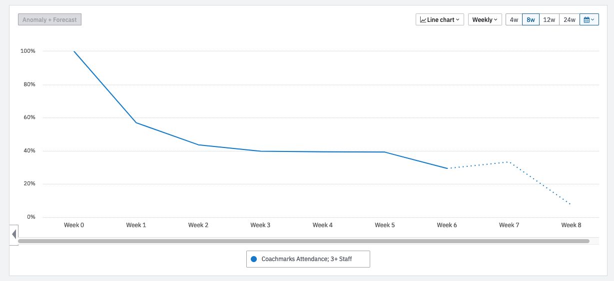
When measuring weekly retention, why is my W1 retention in 4W view vs 8W view so different? ~59 vs 39%. I am pretty confident the inputs are correct. Am I missing something here?
Thanks in advance!