Hi Community 🖐
While doing reports looking back on 2022, I have had to compare a lot of charts to the previous year (2021) especially using a daily granularity to find out specific periods of time which may have heavy impacts on the whole charts. It gets very messy easily (such as in the following picture) and made me wonder about how great it would be to have trendlines in these Conversion Over Time graphs.
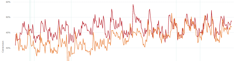
This would allow for quick comparisons and look for impactful specific periods of time while still getting a grasp of the larger (yearly) picture.
I believe it would be hard to recreate complex funnels using segmentation charts, formulas and cohorts.
We could also overlap daily + weekly or monthly granuarities to get an even more accurate depiction of the evolution and its impactful periods.
Don’t hesitate to share your thoughts ! It might be useless 😂