It would be nice in the funnel chart (conversion over time tab) to be able to chart the “Dropoff” instead of the “Conversion”. This would enable classic charts like Bounce Rate.
Thanks for this idea timothy-permutable I’ve just forwarded it to the product team for review! 😀
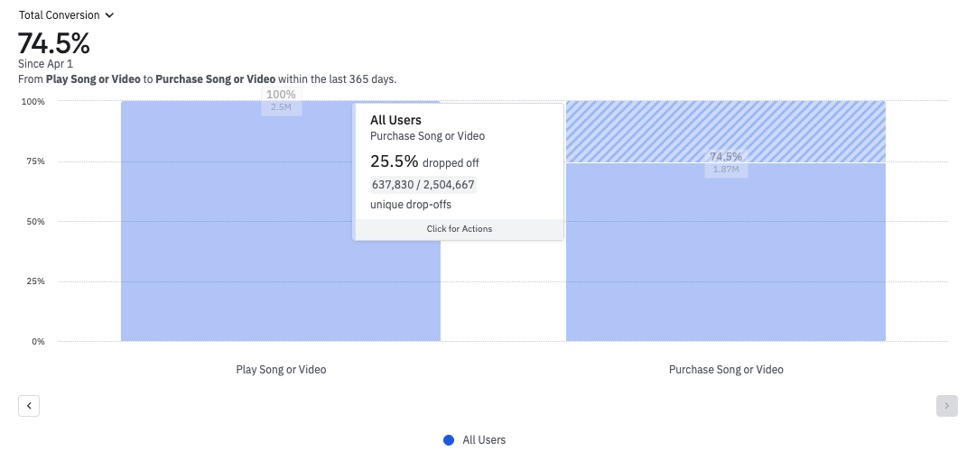
Hey timothy-permutable, this functionality is now available on funnel charts! If you hover over the drop-off area, you can see what percentage this represents. Here’s an example from our demo environment.
It would be really helpful if Amplitude showed which survey a piece of feedback belongs to. Right now, it’s hard to tell where comments originate when multiple surveys are active. As a bonus, it would also be great if the feedback text matched the UI language (currently, mine shows in German).
It would be great to have the option of playing back video (and having the video preview) in a 9:16 (vertical) orientation so that an end user of a video in a guide didn't have to full-screen the video in order to have it play in the correct orientation. It would also be great to have support for Wistia as more and more…
Hi, I’d like to request a feature: it would be really helpful to have the ability to shuffle or reorder properties within an event, especially when grouping. Right now, adjusting the order of grouped outputs is quite cumbersome.
When changing a property value, because we often have complex and long values, we paste the exact value in the search bar. However the matching value will appear at the very top but all other values will remain, which makes the search complex and we lose a few seconds each time Here is a loom to show my point Thanks !!