Hi!
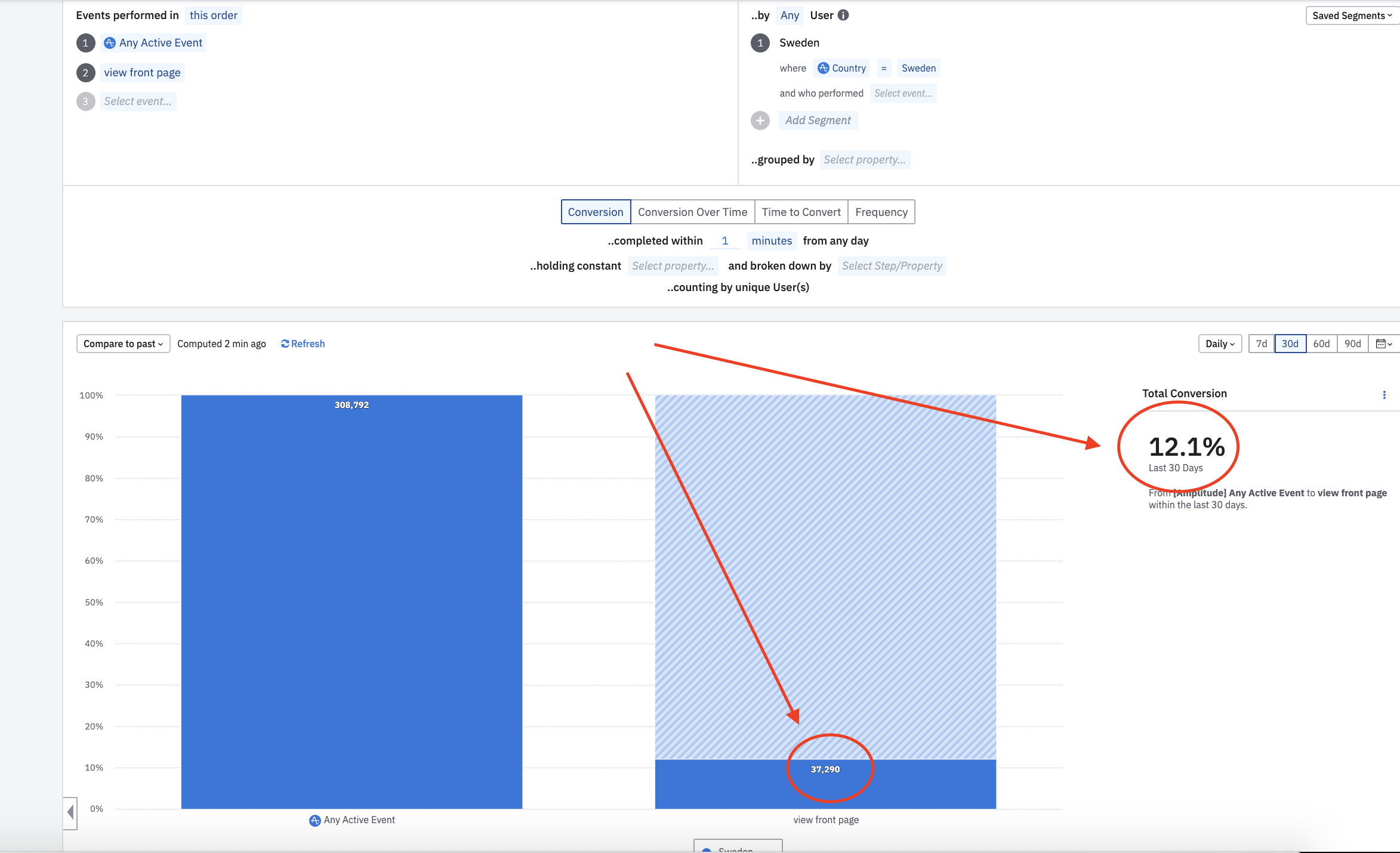
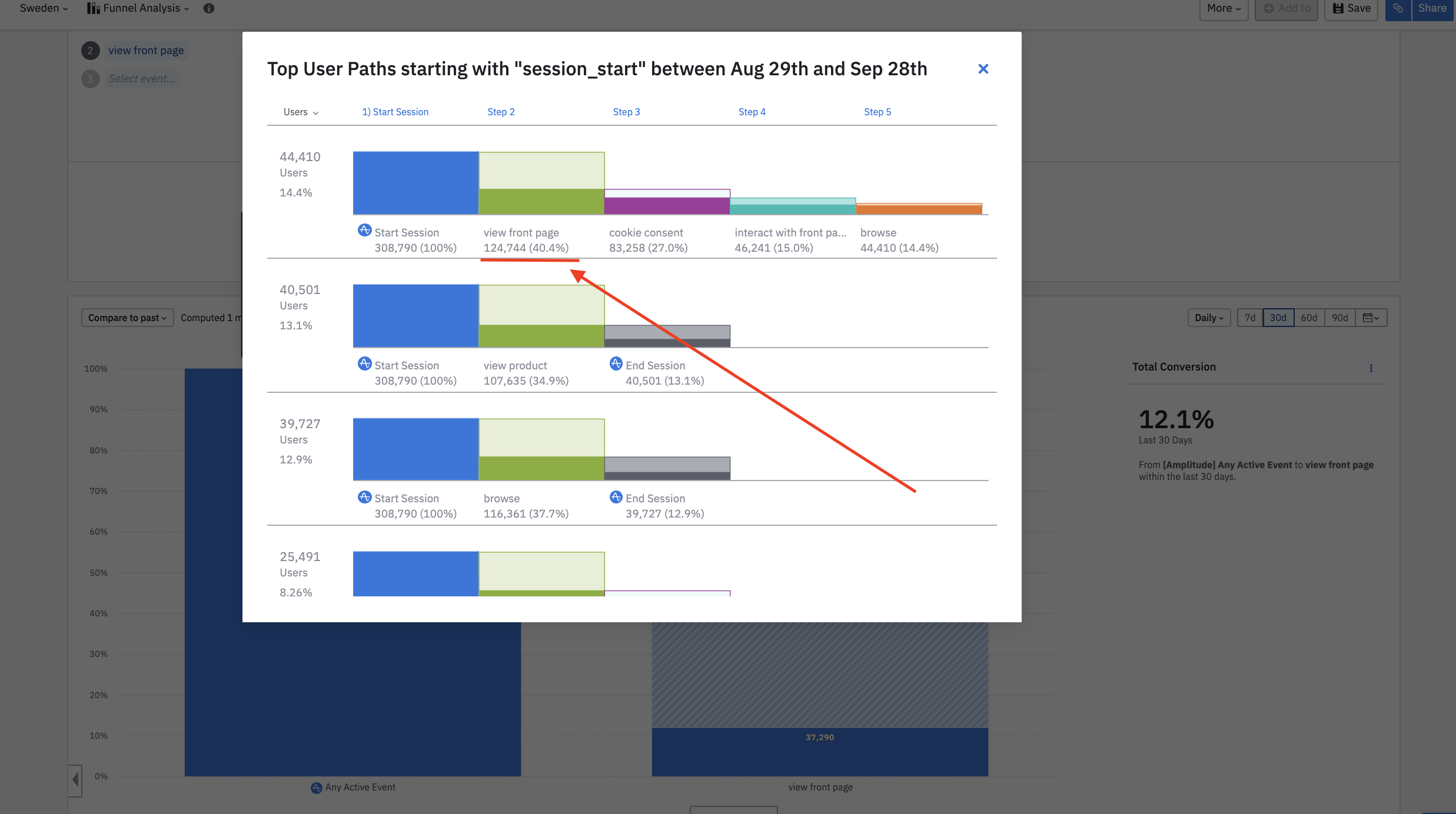
I am struggling to understand why the Funnel Analysis is showing different numbers in the chart or if you look at the ‘show user paths’ in the same chart. I’ve attached two screenshots highlighting the different numbers. I don’t understand how ‘Any active Event’ → ‘view front page’ can show 37 290 (12.1%) in the chart, while ‘Start Session’ (a part of ‘Any Active Event’) → ‘view front page’ show 124 744 (40%)?
Best regards,
Daniel