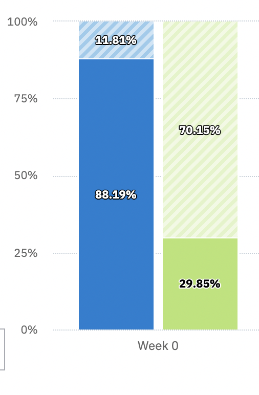
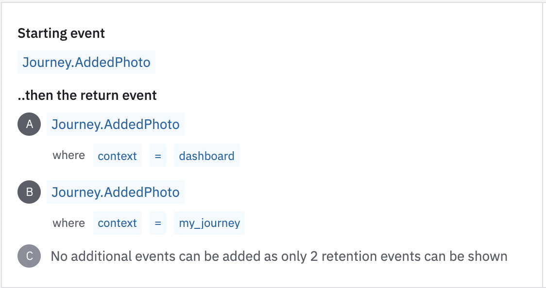
I generated a below retention report. Starting and returning events are same, but I am segmenting return events based on an additional attribute. The attribute only has two possible values and both of them are used as below.
In the report, shouldn’t sum of the return events equal to 100%?