Hi there,
This might seem really picky, but… We’ve got a large number of dashboards / charts that were affected by a recent change a few weeks ago to the series color picker.
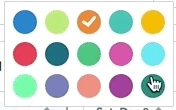
On this link: https://amplitude.com/blog/amplitude-dashboards-charts, the series color picker at the bottom has 15 separate colors…

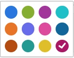
but a recent change that I couldn’t find in any changelog, seems to have completely changed which colors are applied to which series. The color picker now only contains 12 colors:

While ultimately, that’s fine - these colors are still great, the fundamental problem we’ve run into is that we’ve lost the ability to have colors that also indicate their meaning. Previously, for instance, we had a chart that contained something along the lines of GOOD, WARNING, ERROR, which we were able to indicate using green/yellow/red, but with the recent changes, it’s hard to get the colors to look like they’re indicating the same things.
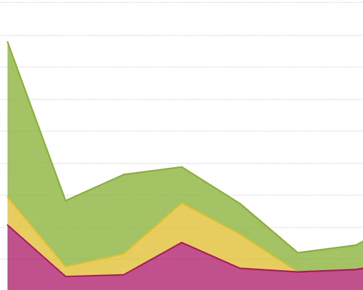
The purplish red that’s highlighted in the second image is… fine, but it doesn’t scream “ERROR” as intensely as the red previously did (1st column, 2nd row). You can see an example chart below.

This is fine, but it’s clearly not the same saturated green we had before and this purplish red works great with charts with the other two purples, if you’re doing a color-scheme thing. Ultimately, it’s just a coloring thing… and we can live with it if we have to.
Either way, I was just wondering… our colors just changed. I had spent a long time picking and choosing colors to match our specific datasets. We had specific colors chosen to match specific devices our application is on (green = xbox, light blue = ios, etc), but all of that data has been lost and I’ve had to go again to remap all of our colors across many charts to have consistent colors for specific divisions of our data. However, what’s the say that the same thing won’t happen again and we’ll lose our custom coloring across all of our charts?
So there’s a few questions here:
- Is there a specific reason the colors were reduced from 15 to 12?
- Why were the 12 colors specifically selected, and why were certain ones left out?
- Is there any plan to create a team-specific/organization-specific color scheme palette so that, if our organization favors specific colors, we can add our own color values?
- This change messed up many of our company’s charts and all of the had to be manually recolored to make sense - is there any way we can protect ourselves from having to do this again if the color schemes change once more?
- Do you guys maintain changelogs that contain when this happened? I couldn’t find any sets of changes that had information about these coloring shifts.
Best answer by ning.chang
View original


