


Greetings, space travellers and fellow Datamonsters!
Here’s a question for you: What’s your fave Event Segmentation chart feature? We want to see the creative ways you’re using our most popular chart type!
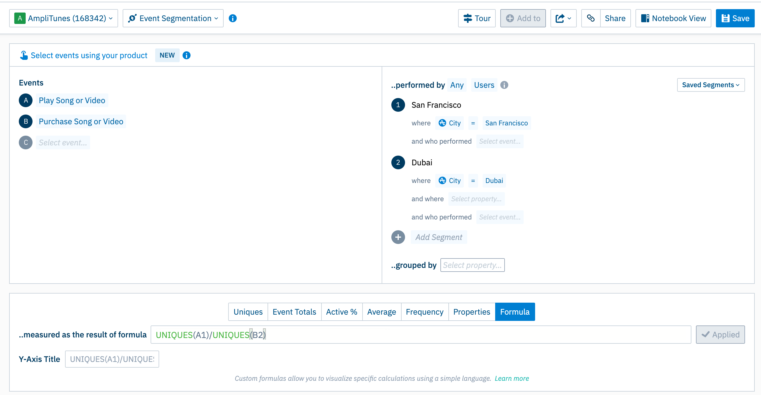
I’ll start! I love the Formula tab for its flexibility and the flare it brings my analyses… I mean, who isn’t impressed by the ability to quickly calculate the number of users between two user segments?
Here’s one I prepared earlier: https://analytics.amplitude.com/demo/chart/new/euyoc4m
Let’s hear all your fun, tried and tested ways of using this powerful space-time bending tool.


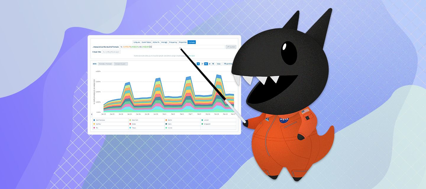
 to the Formula feature and the Stacked Bar Chart view.