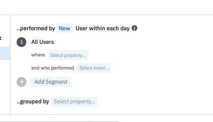
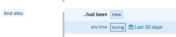
I have a working definition of Activated users and have several charts showing our DAU/WAU/MAU or the CUMSUM of this cohort of users. I’d like to build a chart that specifically shows new activated users. I can do this manually by clicking on the cumsum(activated_users) for week A and create a cohort of weekA_ActivateUsers, then repeat for Week B, then create a new chart with a segment where the users are in A but not in B.
But that is tedious and we want to set up a sync of only newly activated users to send an email out to. A sync won’t be reliable if I have to do this manually.
Does anyone have an automated way to solve this?
Best answer by belinda.chiu
View original